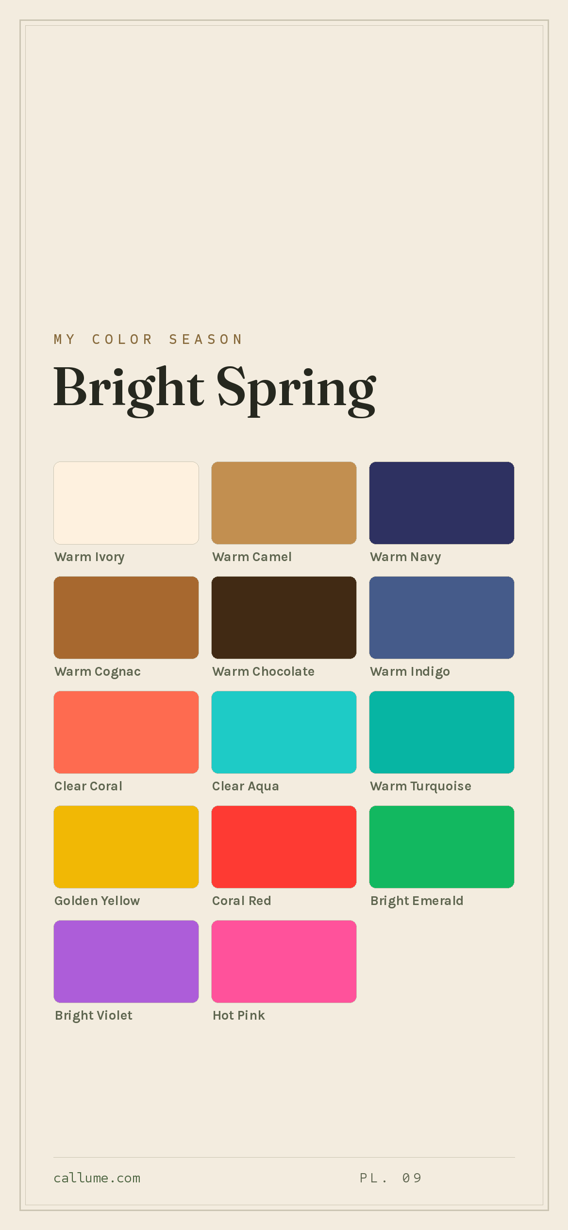
The Bright Spring color palette.
A Bright Spring is warm and vivid at once: clear, high-contrast coloring that carries real electricity. Your colors run clear coral, bright aqua, hot pink, and emerald, jewel-clean and turned up loud. Clarity leads and warmth follows, so bright gold suits you while anything dusty or grayed dies on you. You're one of the few who can wear near-neon color and have it look right.
Read my season freeThe palette
Bright Spring is the loudest, cleanest warm palette on the wheel: color turned up to full volume and kept crystal clear. The brights run clear coral, bright aqua, emerald, and a hot pink, all electric and none of them muddy. Your neutrals still carry warmth, warm ivory and camel and cognac, but they sit against strong darks like warm navy and chocolate, so your palette lives on high contrast.
Take the Bright Spring palette with you
Free downloads, no sign-up: the Bright Spring palette as a lock screen, a desktop, and a wallet card that names its colors — names survive screens; the hexes live above when you need them.
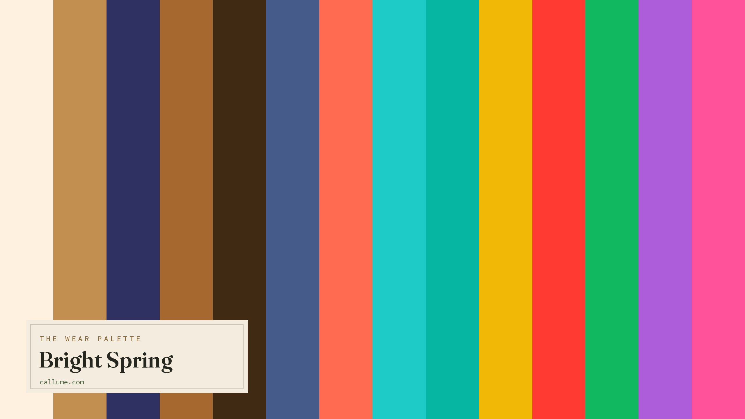
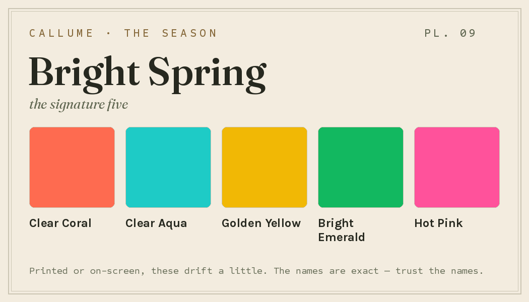
Every color by name
Every color a Bright Spring can wear, by name. Tap one to copy its code.
Neutrals Core color StatementHex codes
For a moodboard, a design tool, or checking a shop listing.
- Warm Ivory#FEF1DF
- Warm Camel#C28F50
- Warm Navy#2E3161
- Warm Cognac#A7682F
- Warm Chocolate#412A14
- Warm Indigo#455B8A
- Clear Coral#FE6B50
- Clear Aqua#1ECBC6
- Warm Turquoise#07B5A3
- Golden Yellow#F1B805
- Coral Red#FE3A33
- Bright Emerald#12B860
- Bright Violet#AD5DD9
- Hot Pink#FF529B
What actually makes you a Bright Spring
No one is squinting at you and guessing here; your season is measured. It's what's left once you read the real color of your skin, hair, and eyes and correct for the light you were photographed in, since a warm lamp or a cool window quietly shifts every color in the frame. Two things stand out for you: your coloring is bright and clear, and it carries a real warmth underneath.
That pairing sets the rules. The clarity, plus your natural contrast, means clean vivid color meets you as an equal while dusty, grayed shades vanish against you. The warmth means gold flatters where cool silver goes flat, and your brights lean toward coral, emerald, and golden yellow rather than icy ones. It's why a hot pink lights you up and a soft mauve looks like nothing at all.
- CIELAB (CIE L*a*b*), the perceptually-spaced color space the measurement works in.
- CIEDE2000, the perceptual color-distance formula used to score you against each season.
- Weatherall & Coombs (1992), Skin color measurements in terms of CIELAB, the basis for reading warm-vs-cool undertone.
Wearing it together
Colors from the deck above, dealt into hands — the move each pairing runs, and the mistake it dodges.
A true complement at matched brightness, so the contrast is carried by hue alone. That matching is the whole trick: pair this red with anything softer and mid-strength and the red simply flattens it.
A neutral bridge: dark-on-cream does the framing so the coral arrives as the only bright in the room. It dodges the classic failure of two loud colors splitting attention, and it replaces black-and-white with a warmth the palette actually owns.
Analogous warm hues with a real light-to-dark step between them, so value separates what chroma can't. Without that step, two colors this saturated just shout over each other; with it, they harmonize at full volume.
A near-complement in equilibrium: warm leather brown against cool-leaning indigo at balanced strength, so neither side wins and neither goes dull. It sidesteps the vibration that full-strength complements risk, because both colors here hold something in reserve.
Colors that fight a Bright Spring
Two kinds of color let you down: the muddy and the cool. Anything dusty or grayed (dusty pastels, muted earth, dusty rose, cool gray) goes dead against your clarity, since your coloring runs on clean, saturated color. The cool ones (cool burgundy, cool pastels, icy lavender) pull against your warm skin and gray it out. Even pure black lets you down, oddly enough: it's flat and lifeless next to your electric brights, and a warm navy carries your contrast far better.
The depth dial
Depth is a dial, not a fork in the road. A fair Bright Spring and a deep Bright Spring wear the same fourteen colors, because undertone and clarity are what the season is; skin depth just re-deals the roles. The palette's chromatic weight sits in the middle of the value range, so as skin runs lighter or deeper, different colors end up sitting near it and different ones end up standing apart from it. Whatever sits near your skin reads as glow, your own warmth turned up rather than a garment laid over it; whatever stands apart gets promoted to contrast duty. The deck never changes. What changes is which colors lead.
The brights sit almost on your skin and read as glow; Warm Chocolate and Warm Navy carry the contrast.
Warm Cognac reads like a second skin; Warm Ivory becomes your sharpest contrast, and Bright Violet glows.
Warm Navy and Warm Indigo turn to glow; Warm Ivory and Golden Yellow now do the contrast work.
Bold or quiet
If your natural contrast runs high, spend this palette the way it was drawn: full-span. Warm Navy straight against Warm Ivory with no buffer between them. Coral Red at jacket scale, answered by Clear Aqua at matched strength. Golden Yellow worn as if it were a basic, because on high-contrast coloring it is one. The hard break, the loud complement, the statement color at full proportion, these are not risks for you; they're the palette doing what it does, and softening them is the actual mistake.
The same deck also plays quiet. Lower-contrast wearers run it in adjacent moves instead of opposing ones: Warm Navy sliding into Warm Indigo, a tonal column of Warm Cognac, Warm Camel, and Warm Chocolate, one bright held to accent scale at the shoe or the scarf while the neutrals carry the frame. Nothing gets swapped out and nothing gets muted; the colors stay at full clarity and the volume lives in how far apart you place them. Same deck either way. Contrast picks your weight.
Bright Spring vs the seasons it's mistaken for
Your two neighbors sit on either side of you: True Spring shares your warmth, Bright Winter shares your brightness. The split from each is a single axis, and it's smaller than it sounds.
| Bright Spring | True Spring | Bright Winter | |
|---|---|---|---|
| Undertone | warm | clearly warm | cool, edging neutral |
| Depth | medium | medium | medium |
| Brightness | vivid, near-neon | clear, jewel-like | vivid, near-neon |
| Contrast | high | moderate | high |
True Spring is the same warmth held at a calmer volume: clear and golden, but not cranked to electric. Bright Spring pushes the contrast and saturation higher, into near-neon territory. If the very loudest, most vivid colors are the ones that flatter you, and the softer clear shades feel a little tame, you're on the Bright Spring side.
Bright Winter is your cool mirror image. It shares the vivid brightness and the high contrast exactly, but it's built on cool undertones instead of warm ones, so its brights lean icy and blue-based. Bright Spring carries warmth through every vivid shade. If warm coral and golden yellow suit you better than cold fuchsia and cobalt, you're a Bright Spring.
One honest caveat: everything on this page is Bright Spring's standard deck, and a standard deck can't see you. It doesn't know whether you're actually a Bright Spring or one of its near neighbors, True Spring a notch calmer or Bright Winter on the cool side of the same brightness. It doesn't know where your skin sits on the depth dial, so it can't tell you which of these colors will read as glow on you and which as contrast. And it can't tell how much contrast your own coloring licenses, whether the hard break is your native register or the analogous run is. Those aren't matters of taste to browse your way toward; they're measurements. This page is the map. Your read is the pin.
Undertone is the one thing a phone camera guesses at, and it's exactly what separates you from Bright Winter. If you're torn between the two, a read that corrects the light before judging your color is the honest tiebreaker. Free, one photo, about fifteen seconds.
Settle it with a free read →Questions
Both are vivid and high-contrast; the split is undertone. Bright Spring is warm, so its brights lean coral, golden yellow, and emerald; Bright Winter is cool, so its brights lean fuchsia, cobalt, and icy blue. If warm, golden vivids flatter you, lean Bright Spring; if cold, blue-based vivids suit you better, lean Bright Winter. Since undertone is the exact thing a phone camera fudges, a light-corrected read is the surest way to settle it.
Warm, though brightness is really the leading note in your coloring. The warmth runs through every vivid shade, which is why gold suits you where cool silver goes flat, and why your best brights are coral and golden yellow rather than icy blue. It's just enough warmth to place you in spring rather than winter.
Anything muddy or cool. Dusty pastels, muted earth, dusty rose, and cool gray go dead against your clarity; cool burgundy, cool pastels, and icy lavender pull against your warm skin. Even pure black falls flat next to your electric brights. Reach for a warm navy or chocolate instead of black, and a clear golden yellow instead of any dusty shade.
Volume. Bright Spring pushes contrast and saturation into near-electric territory, while True Spring holds a warmer, calmer middle ground that's clear but not near-neon. If the loudest, most vivid colors are the ones that flatter you most, lean Bright Spring; if your best colors are warm and clear but a step gentler, you're likely a True Spring.
The five signature Bright Spring colors are Clear Coral, Clear Aqua, Golden Yellow, Bright Emerald, and Hot Pink — the palette's shorthand. The full wear palette runs wider: every color is on this page as a named swatch with its hex code, grouped into neutrals, core colors, and statement colors, with free wallpaper and wallet-card downloads of the whole set.
On this page. Every color in the Bright Spring wear palette is listed with its hex code below the specimen board, with a copy-all button, and the palette comes as a free phone wallpaper, desktop wallpaper, and printable wallet card. No sign-up, nothing to install.