The Bright Winter color palette.
A Bright Winter is cool, vivid, and high-contrast: the loudest, iciest season on the wheel. Your colors are electric and clean: hot pink, clear cobalt, emerald, icy aqua, all set against pure black. Nothing dusty or muted suits you, because clarity turned all the way up is what your coloring runs on. Underneath the brightness you're cool, which is why icy brights lift you where warm ones drag.
Read my season freeThe palette
Bright Winter is color turned all the way up. Think a neon sign against a night sky: hot pink, clear cobalt, electric emerald, all of it set against pure white and pure black. Nothing here is soft and nothing is dusty. The moment a color loses its charge it stops being yours. Even your pale shades read icy, like frost rather than cream.
Take the Bright Winter palette with you
Free downloads, no sign-up: the Bright Winter palette as a lock screen, a desktop, and a wallet card that names its colors — names survive screens; the hexes live above when you need them.
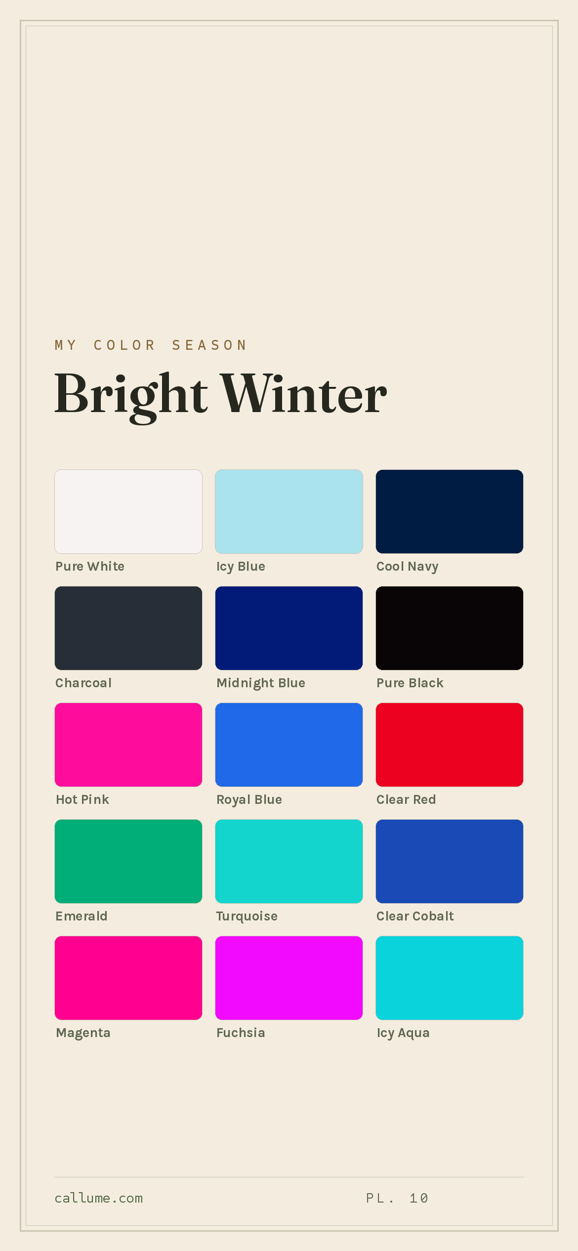
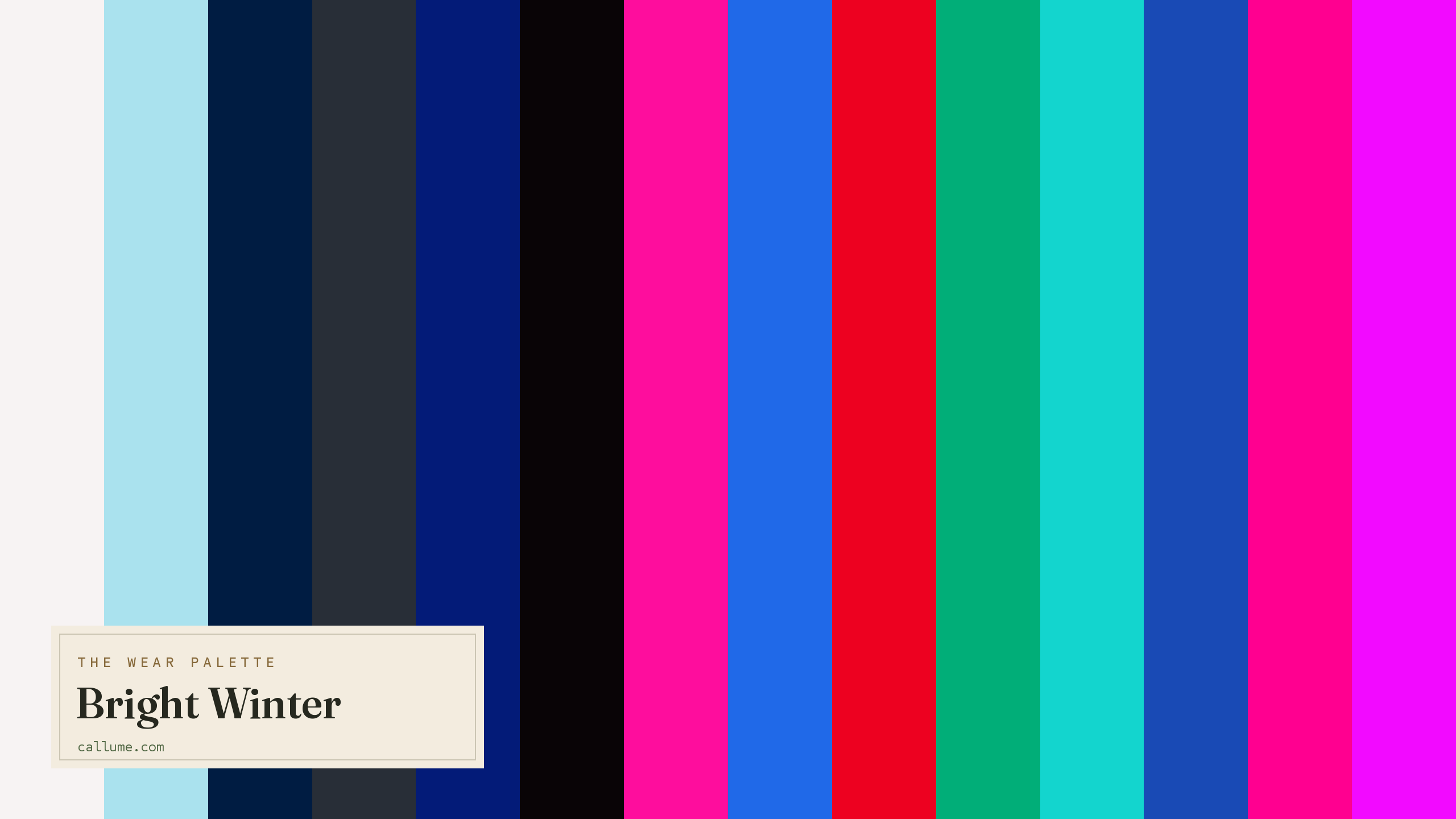
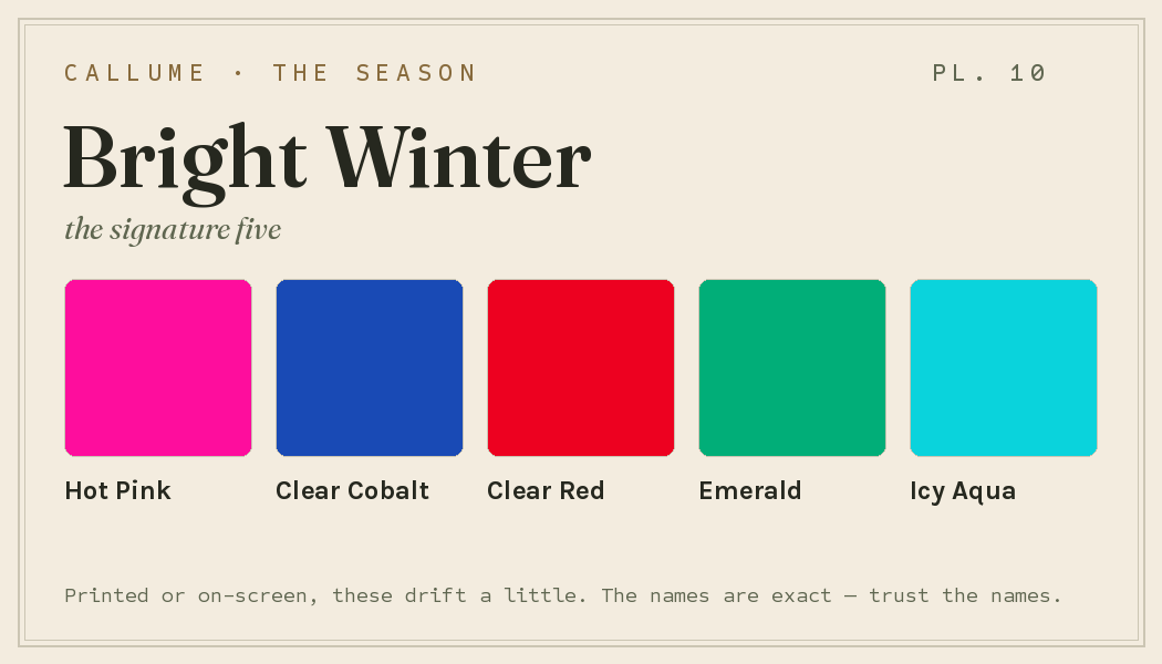
Every color by name
Every color a Bright Winter can wear, by name. Tap one to copy its code.
Neutrals Core color StatementHex codes
For a moodboard, a design tool, or checking a shop listing.
- Pure White#F7F3F3
- Icy Blue#AAE2EE
- Cool Navy#001C42
- Charcoal#282E37
- Midnight Blue#031B78
- Pure Black#090406
- Hot Pink#FE0D9D
- Royal Blue#2069E8
- Clear Red#ED0120
- Emerald#01AE78
- Turquoise#13D5CE
- Clear Cobalt#194AB5
- Magenta#FF0090
- Fuchsia#F20AFF
- Icy Aqua#0AD3DC
- Deep Purple#5F15B7
- Lemon Yellow#F6F544
What actually makes you a Bright Winter
Your season isn't a guess. It's what's left once you measure the real color of your skin, hair, and eyes and correct for the light in the room, since a warm bulb or a bright window quietly shifts every color in a photo. Two things stand out about you: you carry the highest clarity of any season, and underneath that brightness you're cool.
That combination sets the rules. Living on pure, high-charge color means muted and dusty shades die on you: a soft beige next to your face reads like almost nothing. Being cool means warm earth tones (camel, warm orange, mustard) pull against your skin instead of lifting it. You want color that is both clean and cool at once, the loudest, iciest brights on the wheel.
- Weatherall & Coombs (1992), Skin color measurements in terms of CIELAB, the basis for reading warm-vs-cool undertone.
- CIELAB (CIE L*a*b*), the perceptually-spaced color space the measurement works in.
- CIE Standard Illuminant D65, the daylight white point a calibrated read corrects your photo back to.
Wearing it together
Colors from the deck above, dealt into hands — the move each pairing runs, and the mistake it dodges.
A complement with a real lightness gap: the red pops crisply off the navy anchor instead of wrestling it. This dodges the two-reds problem, where neighboring brights at matched volume compete for the lead and neither wins.
Analogous cool hues spanning nearly the whole value range, so the hierarchy comes from lightness alone — the deck's most elegant quiet pairing. It sidesteps the stacked-darks trap, where two deep shades at the same level muddy together.
The neutral bridge: two colors at full volume with an achromatic black between them, so neither has to yield. Without the bridge, brights this loud both demand the lead — that is what this deck's blacks and whites are for.
The neutral-bridge law run from the light side: a hueless white resting against the cobalt's full saturation, crisp definition across the whole value span. Contrast without competition — the failure it dodges is chroma fighting chroma.
Colors that fight a Bright Winter
None of these are bad colors. They just fight you. The warm earth tones (warm earth brown, camel, mustard, olive, warm orange) pull against your cool skin and turn it sallow. The soft ones (beige, dusty pastels, dusty rose) are the other trap: your coloring runs on high charge, so anything watered-down goes flat and takes your face down with it.
The depth dial
Depth is a dial on this deck, not a fork in the road. Whether your skin runs fair or deep, the undertone underneath is the same cool and the clarity is the same electric, so the deck itself never changes — no color enters, none leaves. What changes is the casting: which colors sit close to your own skin's lightness and read as basics, worn like your face's saturation continued, and which sit far from it and read as deliberate contrast. On fairer skin the drama comes from the dark end; as skin deepens, the pole flips and white becomes the sharper tool. Same colors, different jobs.
Black is your bigger lever; the jewels sit near the face while dark neutrals and whites carry the contrast.
Royal Blue and Clear Red turn everyday; black and white read as two matched extremes, equal drama either way.
White takes over as the lever; Clear Cobalt and Deep Purple wear as basics while black goes structural.
Bold or quiet
If your natural contrast runs high — dark hair or eyes against clear, cool skin — this deck lets you spend all of it. Black against white worn as two matched poles, a full-volume bright framed by an achromatic, mirror-polish chrome and patent and lacquer at the hardware: the hard break between light and dark is your native grammar. This is the rare palette where full volume is the documented correct answer, not a stretch.
Lower-contrast Bright Winters exist, and they wear the same deck — just quieter. Trade black-on-white for Charcoal against Icy Blue, run the slow fade instead of the hard break — adjacent values stepping down rather than opposite poles colliding — and take metals to brushed silver rather than mirror chrome. The colors stay electric; only the arrangement softens. Your undertone and clarity set the deck; contrast picks your weight.
Bright Winter vs the seasons it's mistaken for
If a quiz has bounced you between Bright Winter and a neighbor, it's almost always one of these two. All three run bright and high-contrast; the split is warmth and just how loud the color gets.
| Bright Winter | True Winter | Bright Spring | |
|---|---|---|---|
| Undertone | cool, edging neutral | properly cool | warm |
| Depth | medium | medium | medium |
| Brightness | vivid, near-neon | clear, jewel-like | vivid, near-neon |
| Contrast | high | high | high |
True Winter is the cooler, calmer cousin. It sits in bold, saturated jewel tones without pushing all the way to neon, and it's the more decisively cool of the two. If the very loudest, most electric colors on your palette feel the most like you, you're likely on the Bright Winter side.
Bright Spring shares your vivid, high-contrast punch but builds it on warmth: coral, warm yellow, and lime instead of your icy cobalt and fuchsia. If clear warm brights flatter you more than cool ones do, look at Bright Spring.
One honest limit: this page is Bright Winter's standard deck, and that is all it can be. It cannot tell you whether you are actually a Bright Winter or one of its sisters — against True Winter the question is how far the chroma goes, against Bright Spring it is which way the temperature leans. It cannot tell you which of these colors sit closest to your own skin and get to lead, or how hard your contrast licenses you to push the poles. None of those are matters of taste; they are measurements. The deck is the map. Where you stand on it is the part still worth finding out.
Undertone is the slippery part here: whether you're cool or edging warm. That's exactly what a phone's auto-settings tend to get wrong. If you're torn between Bright Winter and a neighbor, a read that corrects the light first is the honest tiebreaker. Free, one photo, about fifteen seconds.
Settle it with a free read →Questions
Both are cool and dramatic; the split is brightness. Bright Winter pushes color to its electric maximum and eases off the cool just slightly. True Winter is bold and clear but not neon, and it's the more decisively cool of the two. If the very loudest, iciest shades feel the most like you, lean Bright Winter, and a light-corrected read will confirm it.
Cool, but edging toward neutral. You're cool underneath, which is why warm colors like gold, camel, and orange tend to pull against your skin and leave it looking tired. The headline for you is clarity: your coloring runs on the highest, cleanest color of any season, so muted and dusty shades go flat on you long before warmth does.
Anything warm or muted. Warm earth brown, camel, mustard, and warm orange fight your cool skin; beige, dusty pastels, and dusty rose go flat because your coloring runs on high clarity. A soft warm beige will basically disappear on you. Reach for clear cobalt, hot pink, and emerald instead, worn against pure black or pure white.
Temperature. Both are vivid and high-contrast, so they get swapped constantly, but Bright Spring builds its brightness on warmth: coral, warm yellow, and lime. Bright Winter builds the same brightness on cool: icy cobalt, fuchsia, and clear emerald. If clear warm brights light up your face, lean Bright Spring; if cool ones do, lean Bright Winter. Since warmth is the exact thing a phone camera fudges, a light-corrected read is the surest way to settle it.
The five signature Bright Winter colors are Hot Pink, Clear Cobalt, Clear Red, Emerald, and Icy Aqua — the palette's shorthand. The full wear palette runs wider: every color is on this page as a named swatch with its hex code, grouped into neutrals, core colors, and statement colors, with free wallpaper and wallet-card downloads of the whole set.
On this page. Every color in the Bright Winter wear palette is listed with its hex code below the specimen board, with a copy-all button, and the palette comes as a free phone wallpaper, desktop wallpaper, and printable wallet card. No sign-up, nothing to install.