The Light Spring color palette.
A Light Spring is light and warm at once: pale, delicate coloring lit with a golden glow. Your colors look like a garden in early morning sun, all peach, coral, warm aqua, periwinkle. Lightness leads and the warmth follows, so soft gold suits you while stark black and icy pastels swamp your gentle features.
Read my season freeThe palette
Light Spring colors look like a flower bed caught in the first hour of sun: warm, pale, and clear all at once. Nothing goes dark and nothing goes muddy. Picture peach, soft coral, warm aqua, buttercream. Your neutrals stay creamy and light, ivory and light camel over anything heavy, and even your boldest shades keep a delicate, sunlit lift.
Take the Light Spring palette with you
Free downloads, no sign-up: the Light Spring palette as a lock screen, a desktop, and a wallet card that names its colors — names survive screens; the hexes live above when you need them.
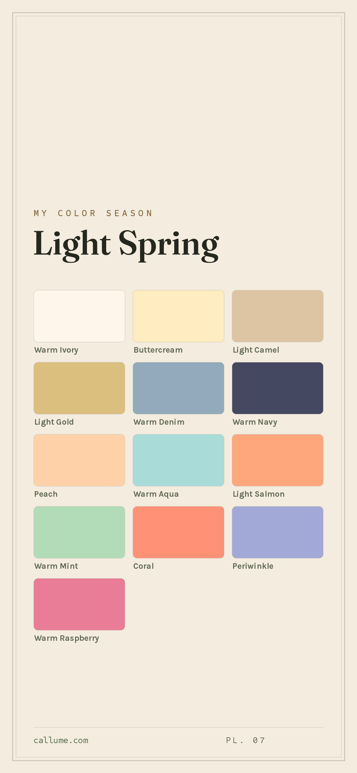
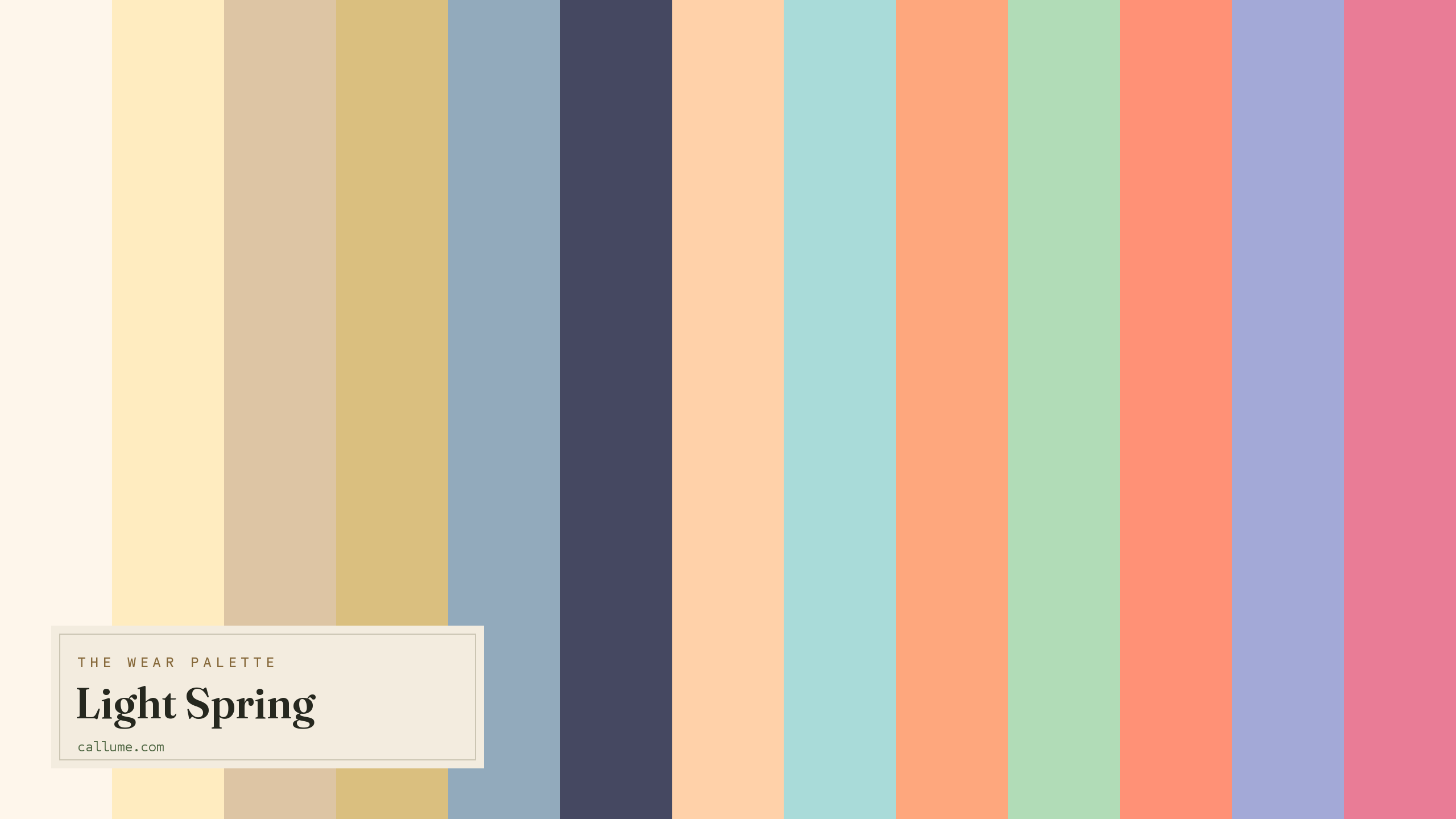
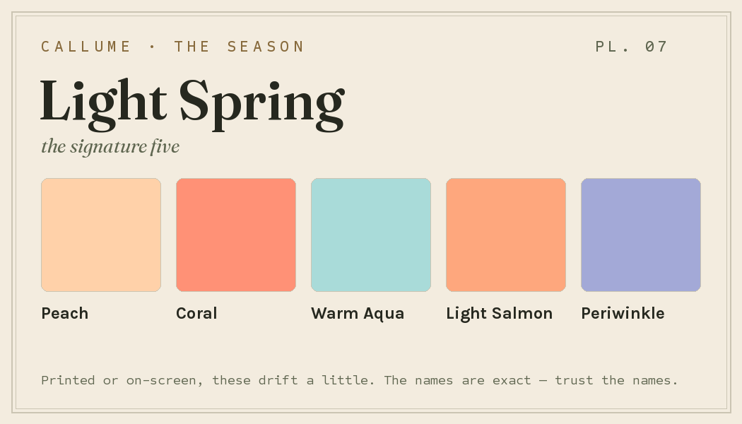
Every color by name
Every color a Light Spring can wear, by name. Tap one to copy its code.
Neutrals Core color StatementHex codes
For a moodboard, a design tool, or checking a shop listing.
- Warm Ivory#FEF6EB
- Buttercream#FFECC0
- Light Camel#DDC5A4
- Light Gold#DABF7F
- Warm Denim#92AABC
- Warm Navy#454861
- Peach#FFD1A9
- Warm Aqua#A9DBD9
- Light Salmon#FEA77D
- Warm Mint#B1DCB7
- Coral#FF9176
- Periwinkle#A3A9D7
- Warm Raspberry#E97C96
What actually makes you a Light Spring
Your season isn't a guess. It comes from reading the real color of your skin, hair, and eyes, once the light you were photographed in has been corrected for, since a warm lamp or a cool window quietly shifts every color in the frame. With the light out of the way, the headline for you isn't the warmth, it's the lightness, with that warmth running just underneath.
That pairing sets the rules. Being light means deep, heavy colors overpower your delicate features, so your palette stays pale and lifted. The warmth underneath means gold flatters where silver goes flat, and creamy shades suit you better than icy ones. It's why a peach lights you up and a hard charcoal shuts you down.
- Weatherall & Coombs (1992), Skin color measurements in terms of CIELAB, the basis for reading warm-vs-cool undertone.
- Chardon, Cros & Bertin (1991), Skin colour typology and suntanning pathways, the Individual Typology Angle behind how depth is read.
- CIELAB (CIE L*a*b*), the perceptually-spaced color space the measurement works in.
Wearing it together
Colors from the deck above, dealt into hands — the move each pairing runs, and the mistake it dodges.
The deck's two poles and its whole answer to black-on-white: the widest value break Light Spring prints, warm on both sides, neither fighting for attention. It dodges the obvious failure — reaching for actual black and optic white, which flatten this coloring instead of framing it.
A near-complement, tamed: soft orange against soft green, with pastel desaturation doing the peacekeeping. At full strength this opposition would vibrate; softened, it reads as the season's signature kind of contrast — interesting without shouting.
An echo — navy deepening periwinkle's own hue — where the value step is essential, not optional. Without the dark anchor underneath, periwinkle floats; with it, one hue does two jobs and the pairing reads deliberate.
Two soft blues with a warm neutral bridge between them — the deck's travel uniform. The camel keeps the blues from reading as an accidental near-match, and nobody has to reach for the grey this season doesn't carry.
Colors that fight a Light Spring
None of these are bad colors. They just work against you. The dark, heavy ones (pure black, dark chocolate, cool burgundy) crush your light features under weight they can't carry. The cool or muddy ones (icy pastel, muted earth) drain the sunlit warmth out of your skin. And pure white, fuchsia, and burnt orange each overpower you a different way: too stark, too harsh, too heavy for coloring this delicate.
The depth dial
Depth is a dial, not a fork in the road. A deeper-skinned Light Spring is still a Light Spring — the warm undertone that put you here doesn't move, and neither does the deck. The same colors hang in the same closet at every depth; what changes is which of them do the loudest work against your skin. At the season's home depth, the pale colors blend into you and the one true dark stands apart. Step deeper and that arrangement quietly inverts: colors that used to disappear become statements, and the light end of the deck starts carrying the contrast instead. Different leads, same cast.
Warm Denim, Periwinkle, and Coral blend near your own value; Warm Navy against Warm Ivory does the distance work.
Much of the deck turns statement; Warm Ivory becomes the loudest color you own, Warm Navy your true dark.
Nothing here sits darker than you; Warm Navy reads as richness, and Warm Ivory carries the whole contrast.
Bold or quiet
If your features run high-contrast, spend this deck at its widest. Warm Navy against Warm Ivory is the season's biggest move — worn as a clean break, jacket against shirt, it gives a defined face the structure it asks for. Coral or Warm Raspberry against the pale neutrals does the same job in color. There is no black-on-white here, and there doesn't need to be: Navy on Ivory is the ceiling, and it's enough.
If your contrast sits lower, the same deck plays quieter. Light Camel with Warm Ivory, Warm Denim with Peach, Buttercream head to toe — neighbors in value rather than opposites, so nothing on you outshouts your own features. Save Warm Navy for one deliberate piece instead of a constant anchor. Notice what didn't change: the colors. High-contrast and low-contrast Light Springs shop the same shelf — contrast picks your weight.
Light Spring vs the seasons it's mistaken for
Your two neighbors sit on either side of you: one shares your lightness, the other your warmth. The Light Summer mix-up is the common one, since you're both pale and delicate, and it's worth understanding why.
| Light Spring | Light Summer | True Spring | |
|---|---|---|---|
| Undertone | warm | cool, edging neutral | clearly warm |
| Depth | light, airy | light, airy | medium |
| Brightness | medium | medium | clear, jewel-like |
| Contrast | low | low | moderate |
Light Summer is your cool twin. You share the paleness, the softness, the low contrast; the split is warmth. Light Summer's pastels are rinsed in cool, so its best colors are soft blue, cool lavender, and rose. Yours carry a golden, sunlit warmth instead. If peach and warm coral flatter you more than powder blue does, you're on the Light Spring side.
True Spring is the same warmth turned up to full strength: deeper, clearer, more saturated. Light Spring is that palette softened and lightened. If full-strength coral and golden yellow flatter you rather than overwhelm, you might be a True Spring.
One honest caveat: this page is Light Spring's standard deck, and that's all it is. It can't tell you whether you're actually a Light Spring or one of its close sisters — Light Summer shares your lightness with the opposite undertone, and that difference doesn't show up in a mirror or a guess. It can't tell you which of these colors lead on your skin and which recede, or how bold your own contrast lets you go with the pairings above. Those aren't things a page can know about you. They're measurements.
Warmth is the one thing a phone camera guesses at, and often gets wrong. If you're stuck between Light Spring and a neighbor, the honest tiebreaker is a read that corrects the light first. Free, one photo, about fifteen seconds.
Settle it with a free read →Questions
This is the most common Light Spring mix-up, and it comes down to warmth. You're both pale, soft, and low in contrast, so nearly everything lines up except undertone. Light Spring runs gently warm, lit with gold; Light Summer runs cool, rinsed with blue. If peach, coral, and warm aqua light you up, lean Light Spring; if soft blue, cool lavender, and rose suit you better, lean Light Summer. Since warmth is the exact thing a phone camera fudges, a light-corrected read is the surest way to settle it.
Warm, but gently. Lightness is the leading note in your coloring and the warmth runs underneath it, just enough to tip you toward spring rather than summer. That's why soft gold suits you while silver tends to go flat, and why creamy shades sit better on you than icy ones.
Anything dark, hard, or cool. Pure black, dark chocolate, and cool burgundy crush your light features; icy pastels and muted earth tones drain your sunlit warmth; pure white, fuchsia, and burnt orange each overpower coloring this delicate. Swap black for a warm navy and stark white for a soft buttercream and you'll see the difference straight away.
Strength. True Spring is the fuller, more saturated, more clearly golden version of the same warm family. Light Spring is that palette softened and lightened to pastel. If full-strength coral and golden yellow flatter you rather than overwhelm, look at True Spring; if every color needs lightening to sit right, you're likely a Light Spring.
The five signature Light Spring colors are Peach, Coral, Warm Aqua, Light Salmon, and Periwinkle — the palette's shorthand. The full wear palette runs wider: every color is on this page as a named swatch with its hex code, grouped into neutrals, core colors, and statement colors, with free wallpaper and wallet-card downloads of the whole set.
On this page. Every color in the Light Spring wear palette is listed with its hex code below the specimen board, with a copy-all button, and the palette comes as a free phone wallpaper, desktop wallpaper, and printable wallet card. No sign-up, nothing to install.