The Light Summer color palette.
A Light Summer is cool and light with low contrast: cool watercolor pastels, soft and airy. Your colors look like a garden after rain: powder pink, lavender, soft sky blue, periwinkle. Lightness is the headline, not the coolness, which is why hard black and stark white overwhelm your delicate coloring. You're the palest cool of the Summers, brighter than a True Summer but never bold.
Read my season freeThe palette
Light Summer is a watercolor left in soft daylight: cool color, but so pale and gentle it seems lit from within. Everything looks rinsed and delicate: powder pink, lavender, soft sky blue, periwinkle. Nothing here is dark and nothing is heavy. Your neutrals stay soft (cool ivory, light gray, soft navy over anything black), and even your brightest shades, a watermelon or a soft raspberry, arrive with the volume turned down.
Take the Light Summer palette with you
Free downloads, no sign-up: the Light Summer palette as a lock screen, a desktop, and a wallet card that names its colors — names survive screens; the hexes live above when you need them.
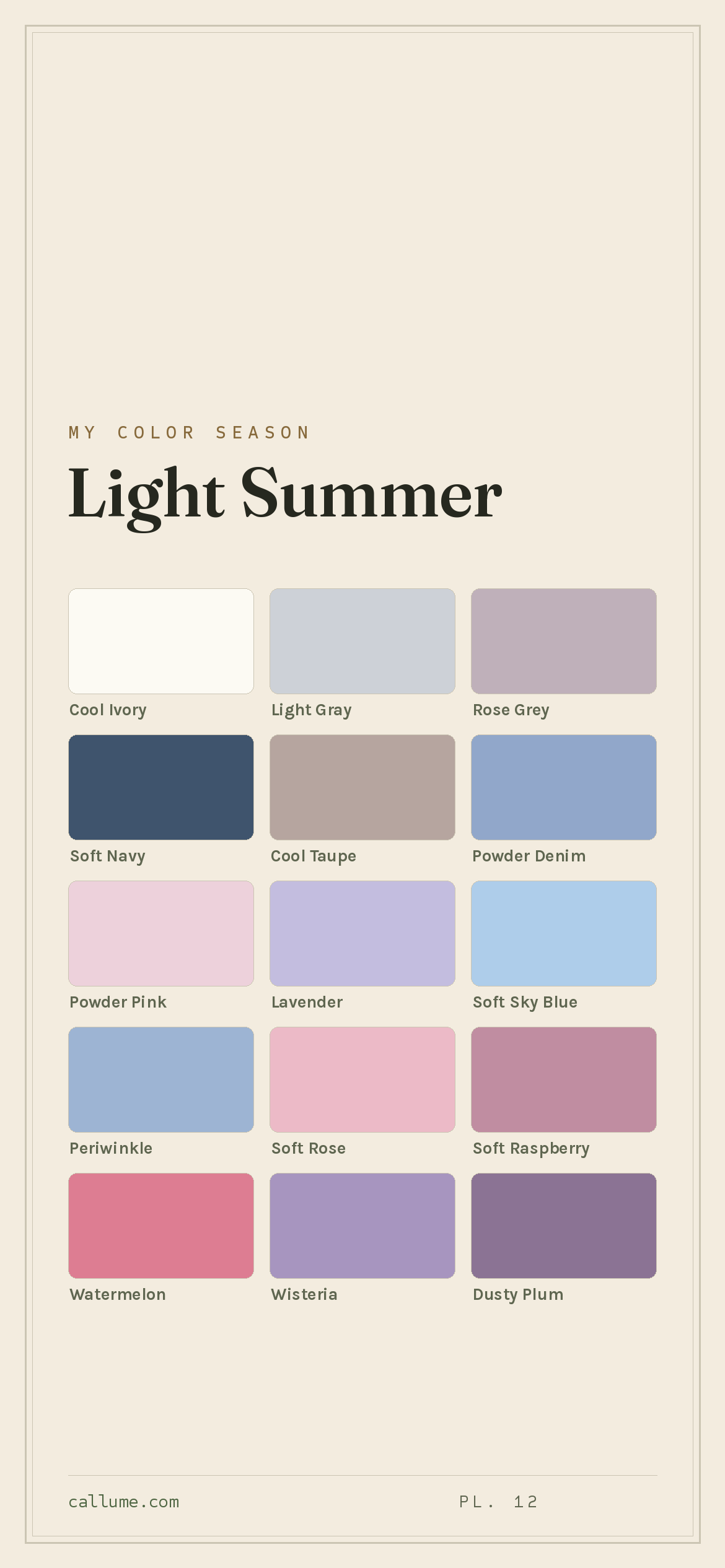
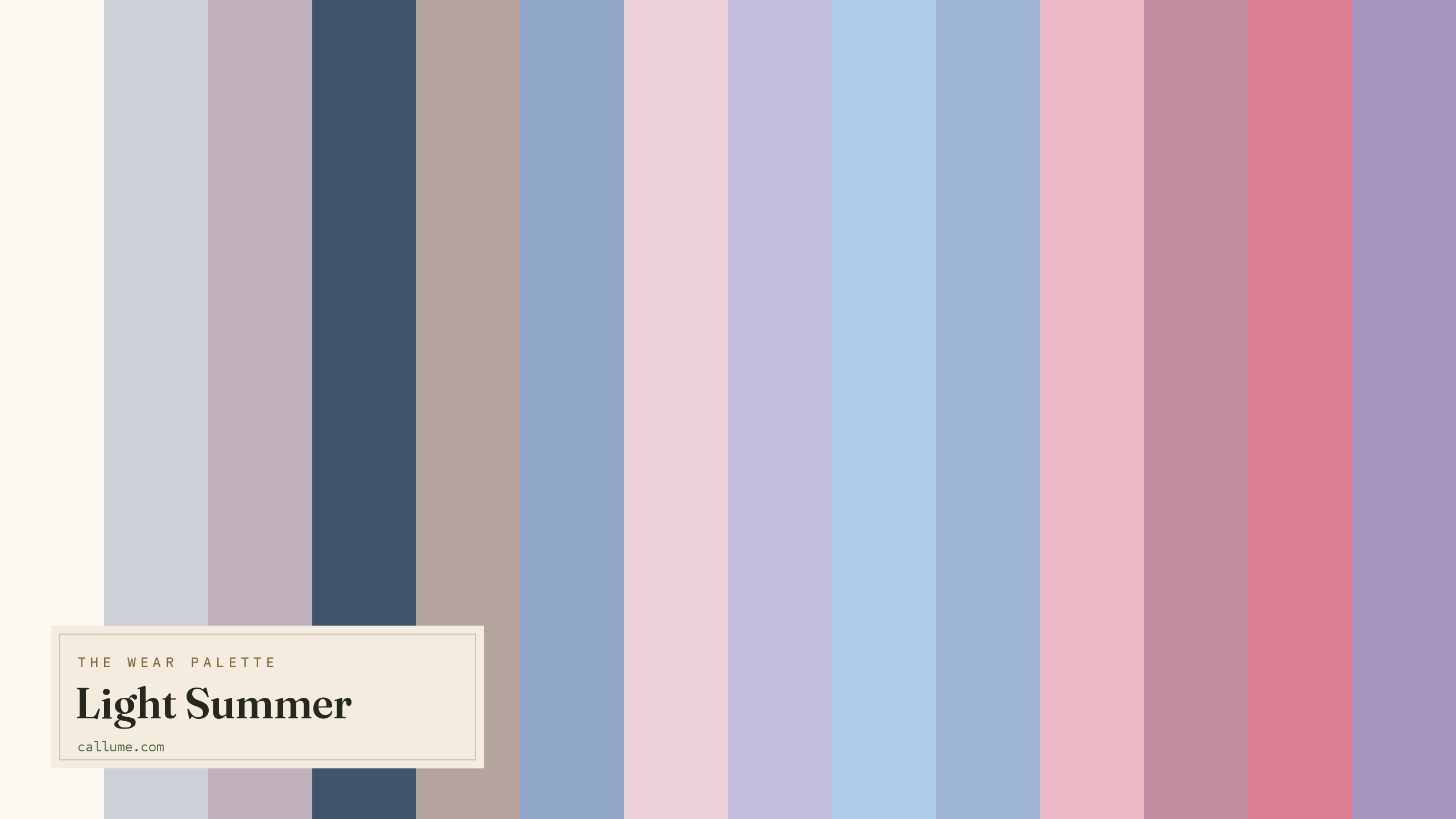
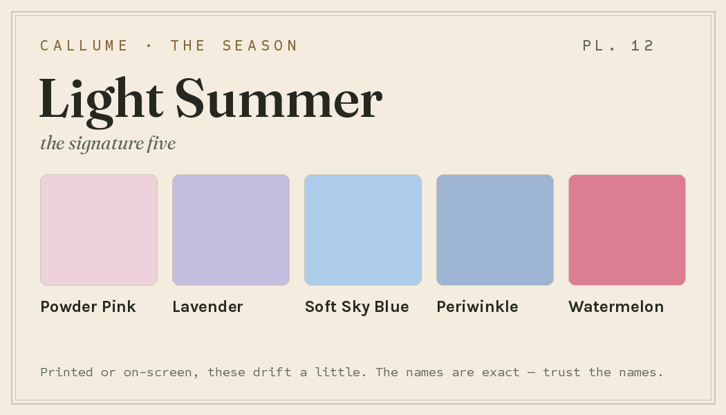
Every color by name
Every color a Light Summer can wear, by name. Tap one to copy its code.
Neutrals Core color StatementHex codes
For a moodboard, a design tool, or checking a shop listing.
- Cool Ivory#FCFAF3
- Light Gray#CDD1D7
- Rose Grey#BFB0BA
- Soft Navy#3F546D
- Cool Taupe#B6A59F
- Powder Denim#91A7CA
- Powder Pink#EDD1DB
- Lavender#C3BDDF
- Soft Sky Blue#AECDEA
- Periwinkle#9DB4D3
- Soft Rose#ECBAC7
- Soft Raspberry#C08DA1
- Watermelon#DD7D92
- Wisteria#A795BF
- Dusty Plum#8B7394
- Soft Teal#82C3C8
What actually makes you a Light Summer
Your season isn't a guess. It's measured: the real color of your skin, hair, and eyes, read only after the room's light has been corrected for, since a warm bulb or a bright window quietly shifts every color in a photo. Two things stand out about you: your coloring is light and low in contrast, and underneath that lightness you're cool.
That pairing sets the rules. Being light and low-contrast means dark, heavy colors swallow you: a true black next to your face reads like a hole cut out of the picture. Being cool means warm colors (warm orange, mustard, peach) pull against your skin instead of lifting it. You want color that stays pale, clear, and cool, the softest cool pastels worn close in tone so nothing jars.
- Weatherall & Coombs (1992), Skin color measurements in terms of CIELAB, the basis for reading warm-vs-cool undertone.
- Chardon, Cros & Bertin (1991), Skin colour typology and suntanning pathways, the Individual Typology Angle behind how depth is read.
- CIELAB (CIE L*a*b*), the perceptually-spaced color space the measurement works in.
Wearing it together
Colors from the deck above, dealt into hands — the move each pairing runs, and the mistake it dodges.
The neutral bridge: the deck's deepest color against its lightest, standing in for the black-and-white this season can't wear. All the structure of hard contrast, none of the flattening.
A complement kept civil: soft pink warmth over deep cool blue, both muted enough that neither argues. The wide value gap gives the outfit a clear hierarchy, which is how it dodges reading as a pastel wash.
An echo: one rose family at two values, light over medium. The step between them is the whole trick, because matched pastels with no gap read as a failed match rather than a choice.
An analogous run down the cool violet-blue arc, each color a genuine step from the last. Runs like this collapse into mush when the values sit too close; Wisteria's extra depth keeps every piece legible.
Colors that fight a Light Summer
None of these are bad colors. They just fight you. Pure black, pure white, and dark brown are too heavy for your light, low-contrast face; next to your coloring they read like a slammed door. The warm, hot ones (warm orange, mustard, peach, neon green, olive) are the other trap: they carry a heat and a punch your gentle cool coloring doesn't, so they overpower your face on sight.
The depth dial
Depth is a dial, not a fork in the road. If you're a Light Summer, you're a Light Summer at any skin depth: the cool undertone underneath the verdict doesn't move, and neither does the deck. What deepening skin changes is which of these colors gets to lead. On fair skin nearly everything sits close to you and the darks are punctuation; as skin deepens, Soft Navy walks in from the edge of the palette to the middle of the wardrobe, and the palest pastels drift from daily basics toward deliberate accents. Same deck at every depth. Different colors up front.
Nearly the whole deck sits close to your skin; Soft Navy and Cool Ivory are the punctuation.
Soft Navy becomes the everyday dark, Dusty Plum goes tonal, and the palest shades become deliberate light beats.
Soft Navy sits nearest your skin as the base; pastels move to accents, worn in graduated steps.
Bold or quiet
Some Light Summers carry more natural contrast than others, and they get to spend this deck at its full span: Soft Navy against Cool Ivory, Watermelon over a pale ground, Dusty Plum breaking up a run of pastels. The colors themselves stay soft; the value jumps do the talking, and the outfit reads composed rather than loud.
Lower-contrast wearers run the same deck closer together: Powder Pink into Rose Grey, Lavender into Periwinkle, Cool Ivory over Light Gray, columns of near-values that blur gently instead of snapping. Neither approach is more correct, and nobody is being demoted to the quiet version; the deck doesn't change, the spacing does. Contrast picks your weight.
Light Summer vs the seasons it's mistaken for
If a quiz has bounced you between Light Summer and a neighbor, it's almost always one of these two. Each shares one of your two headline traits: one your paleness, the other your cool.
| Light Summer | Light Spring | True Summer | |
|---|---|---|---|
| Undertone | cool, edging neutral | warm | properly cool |
| Depth | light, airy | light, airy | medium |
| Softness | medium | medium | soft |
| Contrast | low | low | moderate |
Light Spring is your warm twin: the same pale, delicate lightness built on warmth instead of cool. It glows in peach, warm coral, and butter yellow where you brighten in powder pink and periwinkle. If warm pastels lift your face more than cool ones do, look at Light Spring.
True Summer is the same cool coloring turned up in depth and hazed down: deeper and more muted than you. Its colors are dusty where yours stay clear and pale. If these pastels ever feel too washed-out on you, and slightly deeper cool color suits you better, that's the one to look at.
One honest limit. This page is Light Summer's standard deck: the season's colors, arranged the way they work for most of its wearers. What it can't tell you is whether you're actually a Light Summer rather than a Light Spring or a True Summer, which of these colors should lead against your particular skin, or how wide your own contrast lets you swing between Soft Navy and Cool Ivory. Those aren't things a page can guess. They're things a reading measures.
Undertone is the slippery part here: whether you're cool or edging warm at this kind of lightness. That's exactly what a phone's auto-settings tend to get wrong. If you're torn between Light Summer and a neighbor, a read that corrects the light first is the honest tiebreaker. Free, one photo, about fifteen seconds.
Settle it with a free read →Questions
This is the most common mix-up for you, and it comes down to warmth. Both are pale, light, and low-contrast, so on nearly everything they match. Light Summer is cool (powder pink, periwinkle, soft sky blue), while Light Spring is warm (peach, warm coral, butter yellow). If cool pastels lift your face, lean Light Summer; if warm ones do, lean Light Spring. Since warmth is the exact thing a phone camera fudges, a light-corrected read is the surest way to settle it.
Cool, though gently so rather than icy. Warm colors like orange, mustard, and camel tend to pull against your skin and leave it looking off, while cool powder pink, lavender, and periwinkle make it look fresh. The headline for you is lightness: your coloring is pale and low in contrast, which is why dark, heavy colors overwhelm you well before warmth does.
Depth. Both are cool, but True Summer is deeper and more muted, its colors dustier and a touch stronger than yours. Light Summer is the palest, clearest version of cool color, watercolor pastels worn light. If these pastels ever feel too washed-out on you and slightly deeper cool colors suit you better, look at True Summer.
Anything dark, heavy, or hot. Pure black, pure white, and dark brown overpower your light, low-contrast face; warm orange, mustard, peach, neon green, and olive carry a heat and punch your gentle cool coloring can't match. Swap black for a soft navy and stark white for a cool ivory, and your face reads framed instead of flattened.
The five signature Light Summer colors are Powder Pink, Lavender, Soft Sky Blue, Periwinkle, and Watermelon — the palette's shorthand. The full wear palette runs wider: every color is on this page as a named swatch with its hex code, grouped into neutrals, core colors, and statement colors, with free wallpaper and wallet-card downloads of the whole set.
On this page. Every color in the Light Summer wear palette is listed with its hex code below the specimen board, with a copy-all button, and the palette comes as a free phone wallpaper, desktop wallpaper, and printable wallet card. No sign-up, nothing to install.