The True Winter color palette.
A True Winter is cool, clear, and high-contrast: the jewel-box season. Your colors are bold and true: cobalt, pure red, emerald, icy white, and yes, real black. Nothing muddy or dusty suits you; you're built for clarity. You're one of the few people black and stark white genuinely flatter, because your own coloring already carries that much contrast.
Read my season freeThe palette
True Winter is the jewel box: cool, clear color set against ice-white and a real, honest black. The brights run cobalt, true red, emerald, and a shocking fuchsia. Nothing is greyed or softened, and the moment a color goes dusty it stops being yours. Even your pale shades are icy rather than creamy. Think frost, not cream.
Take the True Winter palette with you
Free downloads, no sign-up: the True Winter palette as a lock screen, a desktop, and a wallet card that names its colors — names survive screens; the hexes live above when you need them.
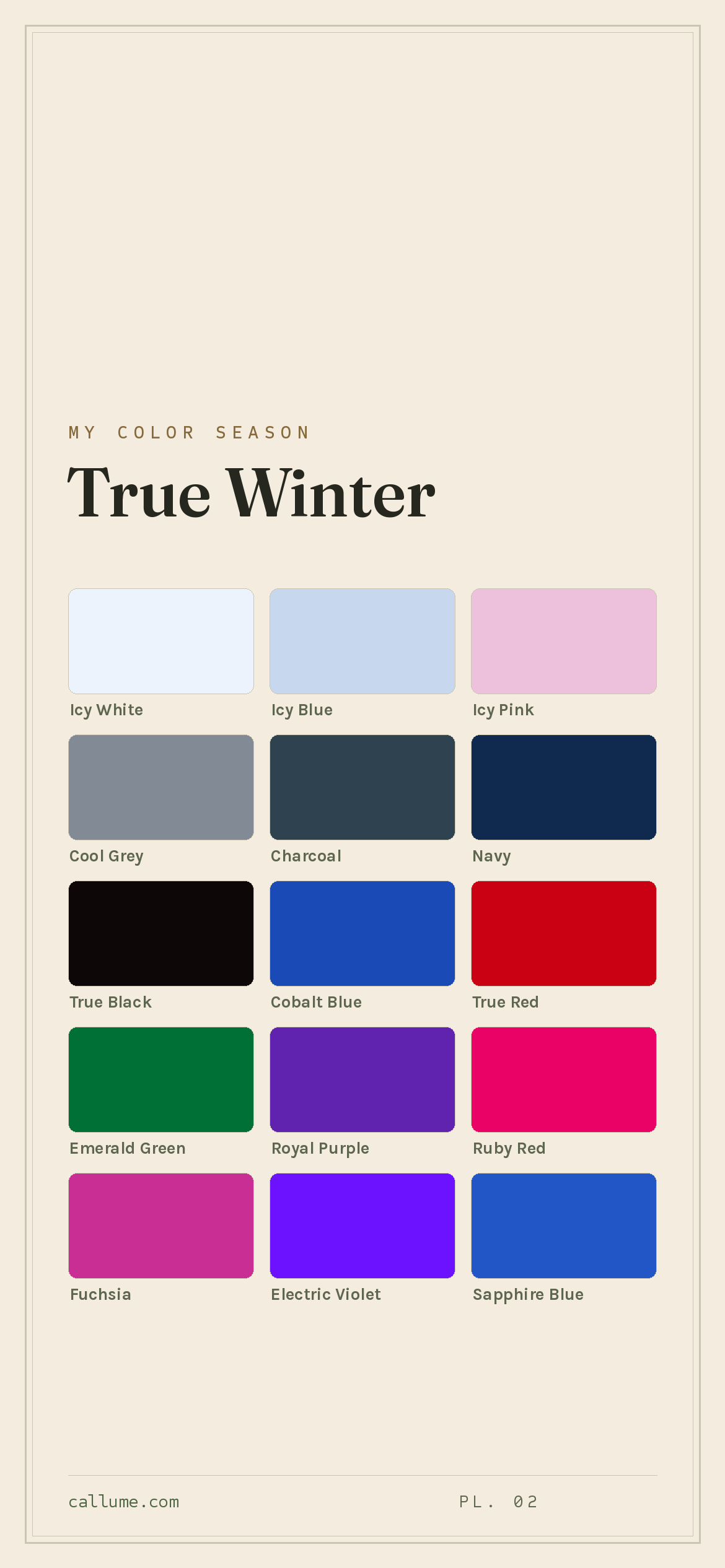
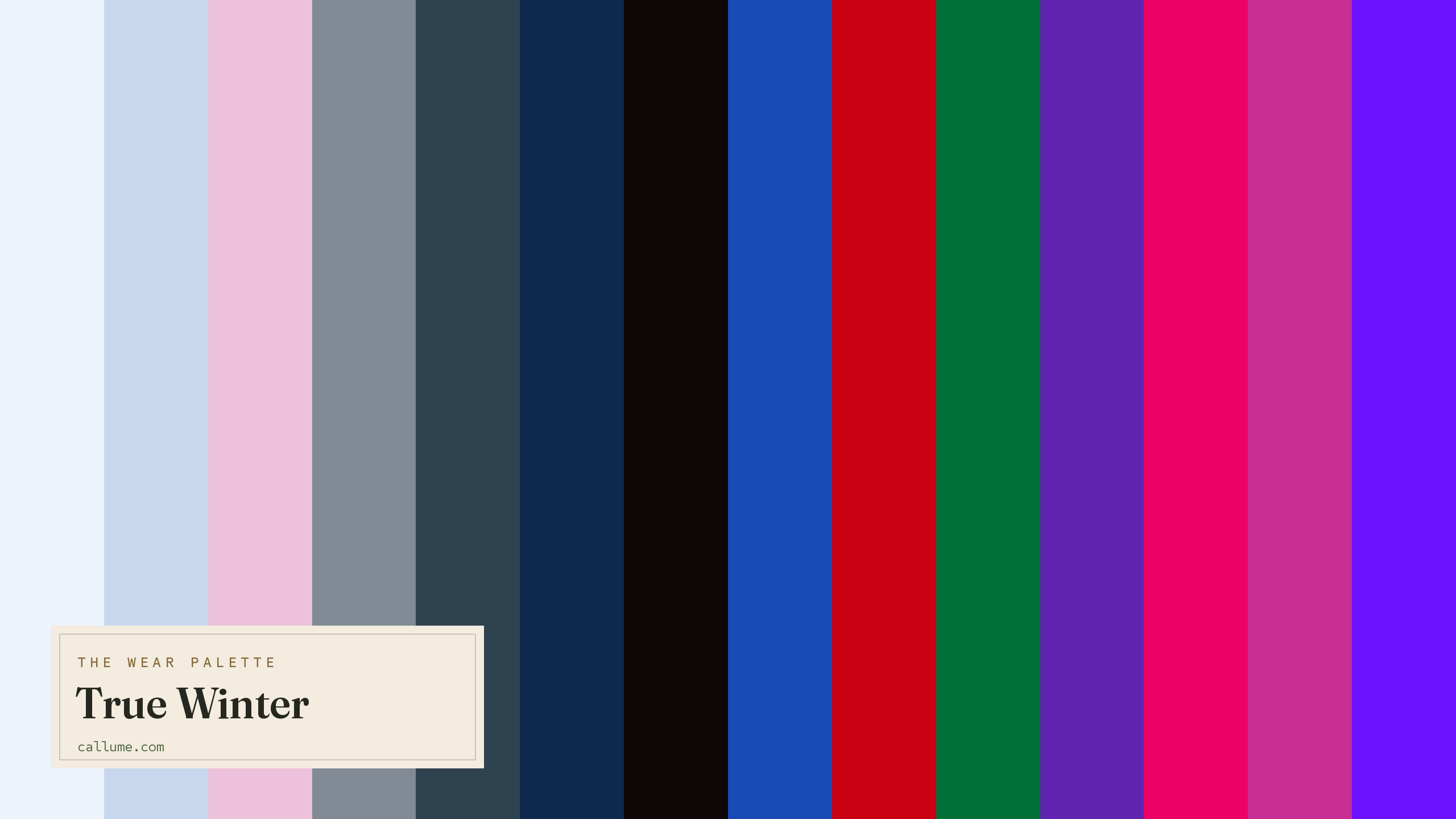
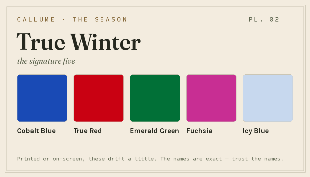
Every color by name
Every color a True Winter can wear, by name. Tap one to copy its code.
Neutrals & icy lights Core color StatementHex codes
For a moodboard, a design tool, or checking a shop listing.
- Icy White#ECF3FC
- Icy Blue#C7D8EE
- Icy Pink#EDC1DB
- Cool Grey#828A96
- Charcoal#2F4250
- Navy#0F294F
- True Black#0D0707
- Cobalt Blue#194AB5
- True Red#C90112
- Emerald Green#017037
- Royal Purple#6023B0
- Ruby Red#EB0267
- Fuchsia#C82E93
- Electric Violet#6C12FF
- Sapphire Blue#2255C5
- Hot Pink#FE0D9D
- Bright Teal#098C91
- Berry#8D0D4E
What actually makes you a True Winter
Your season isn't a guess. It's what's left once you measure the real color of your skin, hair, and eyes and correct for the light in the room. Two things stand out for you: you're deeply cool, and you carry a lot of natural contrast, usually dark hair or eyes against clear, cool skin.
That contrast is why pure black and pure white work on you when they overwhelm most people. Your face already has that much drama, so hard neutrals meet you as an equal instead of drowning you. It's also why anything soft or muted disappears: a gentle beige next to your coloring reads like almost nothing.
- Weatherall & Coombs (1992), Skin color measurements in terms of CIELAB, the basis for reading warm-vs-cool undertone.
- CIELAB (CIE L*a*b*), the perceptually-spaced color space the measurement works in.
- CIE Standard Illuminant D65, the daylight white point a calibrated read corrects your photo back to.
Wearing it together
Colors from the deck above, dealt into hands — the move each pairing runs, and the mistake it dodges.
Near-black to mid-grey is sophistication by pure value structure: aligned cool undertones, wide separation, zero hue argument. Nothing competes, so nothing can clash.
The echo move: one blue at opposite ends of the value axis. It keeps the contrast loud while eliminating hue conflict entirely, which is how you go bold without going busy.
A desaturated cool anchor under a saturated cool accent, with a wide value gap between them — True Winter's core design in miniature. The failure mode it dodges: a bright this loud against a mid-grey just overwhelms it; the accent needs a dark anchor, not a mid one.
The hard break — black straight onto near-white, no mid layer to soften it — with True Red as the one sanctioned accent riding the maximum value gap. Most seasons need that break diluted; yours doesn't.
Colors that fight a True Winter
Two kinds of color let you down: the warm and the muddy. Warm earth tones (camel, warm brown, mustard, gold) pull against your cool skin. Anything dusty or greyed (dusty rose, olive, beige) goes flat, because clarity is what your coloring runs on. On a face with your contrast, a soft warm beige basically vanishes.
The depth dial
Depth is a dial on a fixed undertone, never a new season. A deep True Winter is not drifting toward Dark Winter, and a fair one is not fading toward Summer — the cool, the clarity, and the deck itself never move. What the dial changes is which of these thirty-odd colors lead against your particular skin, and where on the body each one earns its keep. Same jewel box, different arrangement.
The dark shelf leads — Navy, Charcoal, True Black — with Icy White worn freely; mid-tones like Cool Grey stay accents.
Charcoal and Navy carry the everyday; True Black becomes the one deliberate column; Icy White drops to collar-and-cuff dose.
Darks become structure — trouser, coat, base layer — while Icy White and Icy Blue lead near the face. The brights stay yours.
Bold or quiet
A high-contrast True Winter spends this deck at full volume. The column — True Black or Navy worn top to bottom — needs no white shirt to break it, because a face with that much built-in drama supplies the break itself. The hard break is the other signature: True Black meeting Icy White with no mid layer between them, the move other seasons have to run softer. Jewel accents go on dark anchors — Emerald Green or Fuchsia against True Black — where the darkness makes the color sing.
A lower-contrast True Winter wears the same deck quieter, not a different deck. The poles shrink to doses — Icy White at the collar rather than the full column — and Cool Grey or Navy bridges what the high-contrast wearer would leave as a hard edge. The icy accents can even carry a look on their own: Icy Blue and Icy Pink at matched lightness make an accent duet, the deck's rare low-contrast harmony. Same colors, same undertone, different volume — your contrast picks your weight.
True Winter vs the seasons it's mistaken for
If you've been bounced around the Winters, it's usually to one of these two. All three are cool and dramatic; the difference is how bright and how deep.
| True Winter | Bright Winter | Dark Winter | |
|---|---|---|---|
| Undertone | properly cool | cool, edging neutral | cool, edging neutral |
| Brightness | clear, jewel-like | vivid, near-neon | clear |
| Depth | medium | medium | deep |
| Feel | bold, true color | electric | rich, shadowy |
Bright Winter turns the brightness up to almost neon and eases off the cool a little. If the very loudest colors on your palette feel the most like you, and warmer-edged brights don't bother you, that's the one to check.
Dark Winter takes the same cool drama and deepens it, adding a touch of warmth, burgundy and forest green over your cobalt and ice. If deep, slightly warmer jewel tones suit you better than icy pastels, look there.
Everything on this page is True Winter's standard deck, and a standard deck can only take you so far. What it cannot know is whether you are actually a True Winter rather than a Bright or Dark Winter — sister seasons that fork the same cool identity toward chroma or depth — which of these colors should lead on your particular skin, and how hard your own contrast lets you push the breaks. Those are measurements, not descriptions: temperature, depth, and contrast read from your actual coloring, corrected for the light in the room. A page can hand you the jewel box; a reading tells you which drawer opens first.
The tricky part is undertone: whether you're truly cool or edging warm. That's exactly what a phone's auto-settings tend to get wrong. If you're torn between the Winters, a read that fixes the light first is the honest tiebreaker. Free, one photo, about fifteen seconds.
Settle it with a free read →Questions
Yes, two names for the same season. Some systems say "Cool Winter" and others say "True Winter," but both mean cool, clear, high-contrast coloring: cobalt, true red, emerald, and icy white against real black. If you've been called one, you're the other too.
Yes, you're one of the few seasons black genuinely flatters. Your own coloring already carries a lot of contrast, so a true black meets it head-on instead of overpowering you. It's the softer, warmer seasons that black tends to swallow, not you.
Both are cool and dramatic; the split is brightness. Bright Winter pushes into almost-neon color and eases off the cool a little. True Winter is bold and clear but not electric, and it's the cooler of the two. If the very brightest shades feel the most like you, lean Bright Winter, and a light-corrected read will confirm it.
Anything warm or muddy. Camel, warm brown, mustard, and gold fight your cool skin, while dusty rose, olive, and beige go flat because your coloring wants clarity. A soft warm beige will basically disappear on you. Reach for clear cobalt, true red, and emerald instead.
The five signature True Winter colors are Cobalt Blue, True Red, Emerald Green, Fuchsia, and Icy Blue — the palette's shorthand. The full wear palette runs wider: every color is on this page as a named swatch with its hex code, grouped into neutrals, core colors, and statement colors, with free wallpaper and wallet-card downloads of the whole set.
On this page. Every color in the True Winter wear palette is listed with its hex code below the specimen board, with a copy-all button, and the palette comes as a free phone wallpaper, desktop wallpaper, and printable wallet card. No sign-up, nothing to install.