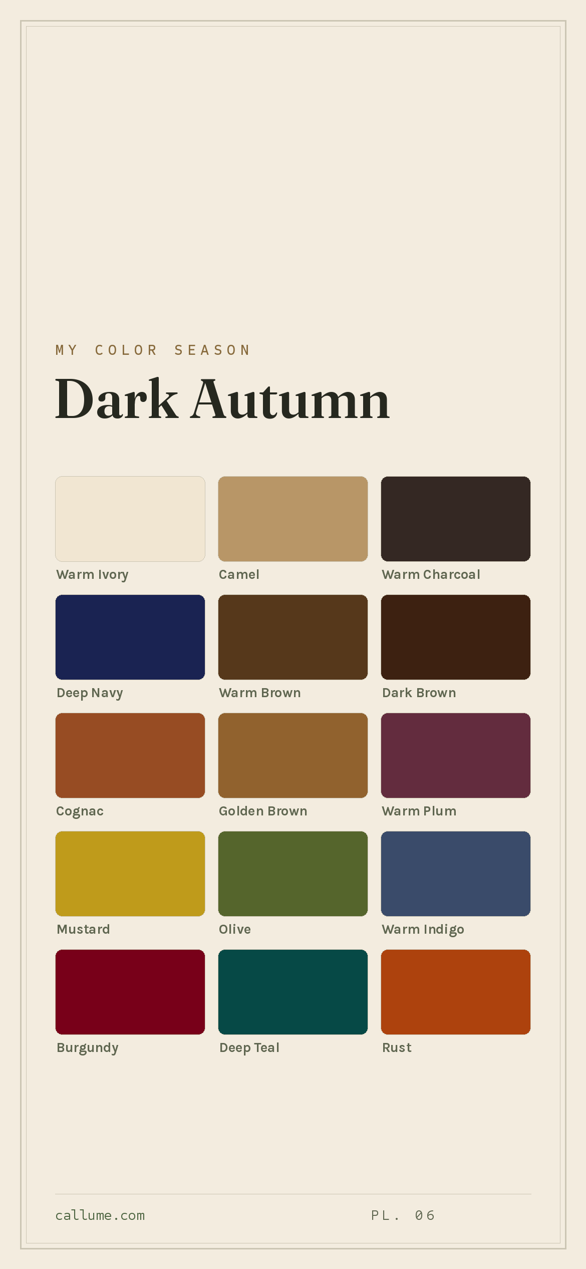
The Dark Autumn color palette.
A Dark Autumn is deep and warm, with dramatic jewel-earth color. Your best colors are rich and shadowy but never cold: burgundy, deep teal, rust, golden brown. Depth leads and warmth follows, so where a True Autumn glows in the golden middle, you sit in the deep, dramatic end of the same warm family.
Read my season freeThe palette
Dark Autumn is the deep, warm jewel box: earth tones taken to their richest, most dramatic depth. Think embers and dark spice rather than bright leaves. Burgundy, deep teal, rust, and golden brown carry the palette, and your neutrals go to warm charcoal and near-black brown rather than cool black. Full, deep color is where you come alive.
Take the Dark Autumn palette with you
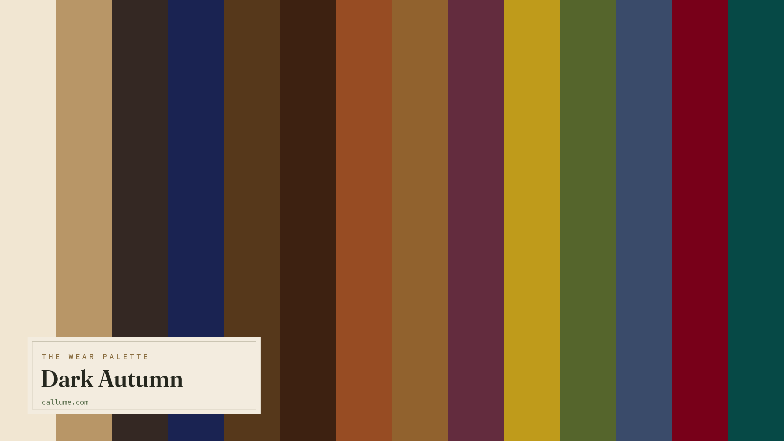
Free downloads, no sign-up: the Dark Autumn palette as a lock screen, a desktop, and a wallet card that names its colors — names survive screens; the hexes live above when you need them.

Every color by name
Every color a Dark Autumn can wear, by name. Tap one to copy its code.
Neutrals Core color StatementHex codes
For a moodboard, a design tool, or checking a shop listing.
- Warm Ivory#F1E6D2
- Camel#B89667
- Warm Charcoal#342823
- Deep Navy#1A2352
- Warm Brown#56381B
- Dark Brown#3D2111
- Cognac#974C23
- Golden Brown#91622E
- Warm Plum#632C3E
- Mustard#BF9B1B
- Olive#55652C
- Warm Indigo#3A4B6A
- Burgundy#780019
- Deep Teal#064946
- Rust#AD420D
- Tomato Red#CB3522
What actually makes you a Dark Autumn
Your season is measured, not guessed: it comes from reading the real color of your skin, hair, and eyes once the light has been corrected. Two things stand out about you: real depth, and a warm undertone running through all of it. Your coloring is dark and rich, but it never goes cold.
That depth is why you can wear the deepest colors on the wheel and why pale, washed-out shades disappear on you. The warmth is why those deep colors need to be earthy rather than icy. A cool burgundy fights you; a warm, brown-based burgundy is home.
- Weatherall & Coombs (1992), Skin color measurements in terms of CIELAB, the basis for reading warm-vs-cool undertone.
- Chardon, Cros & Bertin (1991), Skin colour typology and suntanning pathways, the Individual Typology Angle behind how depth is read.
- CIELAB (CIE L*a*b*), the perceptually-spaced color space the measurement works in.
Wearing it together
Colors from the deck above, dealt into hands — the move each pairing runs, and the mistake it dodges.
A warm-cool complement at matched depth: the two darks sit at the same value, so the blue-against-brown tension reads as contrast, not collision. This is how you get drama without the jarring edge a lighter blue would bring.
A tonal echo, graduated: same warm brown family, wide value gap. The gap is what keeps two browns from sliding into mud — this reads as deliberate depth, not an accident of the closet.
Analogous warm hues split by a wide value gap: the ivory and the red agree on temperature, so the pairing gets clarity from lightness alone. No chroma fight, no vibration — just a clean, warm break.
A neutral bridge: Warm Charcoal is the near-ideal ground under the deck's biggest chroma, letting Rust burn at full strength. A true black would deaden it; the warm charcoal deepens it instead.
Colors that fight a Dark Autumn
Pale, cool, and icy colors all let you down. Pastels and cool light greys are far too weak for your depth and vanish against you. Icy blues and lavenders fight your warmth and read cold. Even pure white is too stark and too cool; a warm ivory does the same job without the chill.
The depth dial
Depth is a dial, not a different season. If you're a Dark Autumn, you're a Dark Autumn at every skin depth — fair, medium, or deep — because the verdict rides your warm undertone and the overall darkness of your coloring, not the shade of your skin alone. The deck above never changes: same sixteen colors, same avoid list, same warm metals. What changes with depth is casting — which colors do the everyday work near your face and which become the supporting act. 'Dark' describes where the palette's colors sit, not where your skin must.
Warm Charcoal and Dark Brown are everyday darks; the deck's deepest neutrals land right where your contrast wants.
Contrast starts reading as deliberate; Warm Brown leads day to day, and the darkest neutrals become reach pieces.
The dark neutrals go tonal; Cognac, Rust, and Golden Brown take over the near-face contrast work.
Bold or quiet
If your own coloring runs high-contrast — dark hair and eyes against lighter skin — you spend this deck at full volume. The darkest neutrals are daily wear, not occasion pieces: Dark Brown outerwear, Warm Charcoal trousers, Deep Navy tailoring. Hard breaks are yours — Dark Brown against Warm Ivory is the deck's widest span, and it reads crisp rather than costume. The wow tier works as true statement: Burgundy or Rust set against a quiet dark, one saturated argument per outfit. Even polished finishes — hard wool, burnished leather — read intentional, because your own contrast pays for the shine.
Lower-contrast wearers own the exact same sixteen colors and wear them blended. Skip the hard break and run the slow fade instead: Olive into Cognac into Rust, colors that sit close in value and move like one material. One-color dressing in a rich dark is a signature, not a compromise, and the palette's boldest shades still show up — worn near the face at garment scale rather than as a collision, in matte-to-waxed finishes that carry richness through hue instead of gleam. Same deck, quieter delivery. That's the rule underneath both paragraphs: the palette is fixed, and your contrast picks your weight.
Dark Autumn vs the seasons it's mistaken for
Dark Autumn's neighbors share either its depth or its warmth, but not both.
| Dark Autumn | Dark Winter | True Autumn | |
|---|---|---|---|
| Undertone | warm | cool, edging neutral | clearly warm |
| Depth | deep | deep | medium |
| Clarity | medium | clear | soft |
| Contrast | fairly high | high | moderate |
Dark Winter shares your depth and drama but runs cool: icy white, blue-red burgundy, cool forest. Dark Autumn is warm all the way through, with brown-based, golden versions of the same deep colors. If your best deep shades are icy and cool rather than earthy, look at Dark Winter.
True Autumn is the same warm earth at a golden medium depth, glowing rather than shadowy. Dark Autumn drives it deeper and more dramatic. If bright rust and cognac suit you better than deep burgundy and near-black brown, you may be True Autumn.
One honest limit: this page is Dark Autumn's standard deck, and that's all it can be. It can't tell you whether you're actually a Dark Autumn or one of its close neighbors — Dark Winter shares your depth and differs only in warmth, and that line is exactly where guessing goes wrong. It can't tell you which of these sixteen colors should lead against your particular skin, or how hard a break your own contrast will carry. Those aren't matters of taste; they're measurements — undertone, depth, contrast, read from you rather than assumed. The deck is the map. Where you stand on it takes a reading.
Telling deep-warm from deep-cool is one of the harder calls to make, and it's exactly the kind of thing a phone's lighting throws off. A read that corrects the light first settles it. Free, one photo, about fifteen seconds.
Settle it with a free read →Questions
Both are deep and dramatic; the difference is undertone. Dark Autumn is warm all the way through, with earthy, brown-based versions of deep colors like burgundy and forest. Dark Winter runs cool, with icy whites and blue-based deep shades. If gold jewelry and warm, earthy darks suit you, lean Dark Autumn; if silver and cool, icy darks look better, lean Dark Winter. A light-corrected read is the surest way to settle a warm-versus-cool call.
Warm. Depth is your dominant quality, but a warm undertone runs through all of it, which is why your deep colors need to be earthy rather than icy, and why gold beats silver on you. A cool burgundy fights your skin; a warm, brown-based one flatters it.
Pale, cool, and icy colors. Pastels and cool light greys are too weak for your depth and disappear on you; icy blues and lavenders read cold against your warmth; pure white is too stark. Reach for deep warm colors like burgundy, deep teal, and golden brown, and swap stark white for warm ivory.
Depth. True Autumn glows at a golden medium depth; Dark Autumn drives the same warm earth tones deeper and more dramatic, toward near-black. If deep burgundy and forest green feel more like you than bright rust and cognac, you're likely Dark Autumn.
The five signature Dark Autumn colors are Burgundy, Deep Teal, Rust, Golden Brown, and Cognac — the palette's shorthand. The full wear palette runs wider: every color is on this page as a named swatch with its hex code, grouped into neutrals, core colors, and statement colors, with free wallpaper and wallet-card downloads of the whole set.
On this page. Every color in the Dark Autumn wear palette is listed with its hex code below the specimen board, with a copy-all button, and the palette comes as a free phone wallpaper, desktop wallpaper, and printable wallet card. No sign-up, nothing to install.