The True Autumn color palette.
A True Autumn is warm and golden, with rich, earthy color at medium depth. Your best colors look like a forest in October: rust, cognac, mustard, olive, warm teal. Warmth leads and everything else follows, so where a Soft Autumn is greyed and a Dark Autumn is deep, you sit in the full, golden middle.
Read my season freeThe palette
True Autumn is the richest warm palette, all golden earth and spice. Nothing here is cool or icy; the colors glow like turning leaves and old copper. Rust, cognac, burnt orange, mustard, and olive do the heavy lifting, and your neutrals are warm browns and ivory rather than grey or black. This is the season that can wear full-strength color without it looking loud.
Take the True Autumn palette with you
Free downloads, no sign-up: the True Autumn palette as a lock screen, a desktop, and a wallet card that names its colors — names survive screens; the hexes live above when you need them.
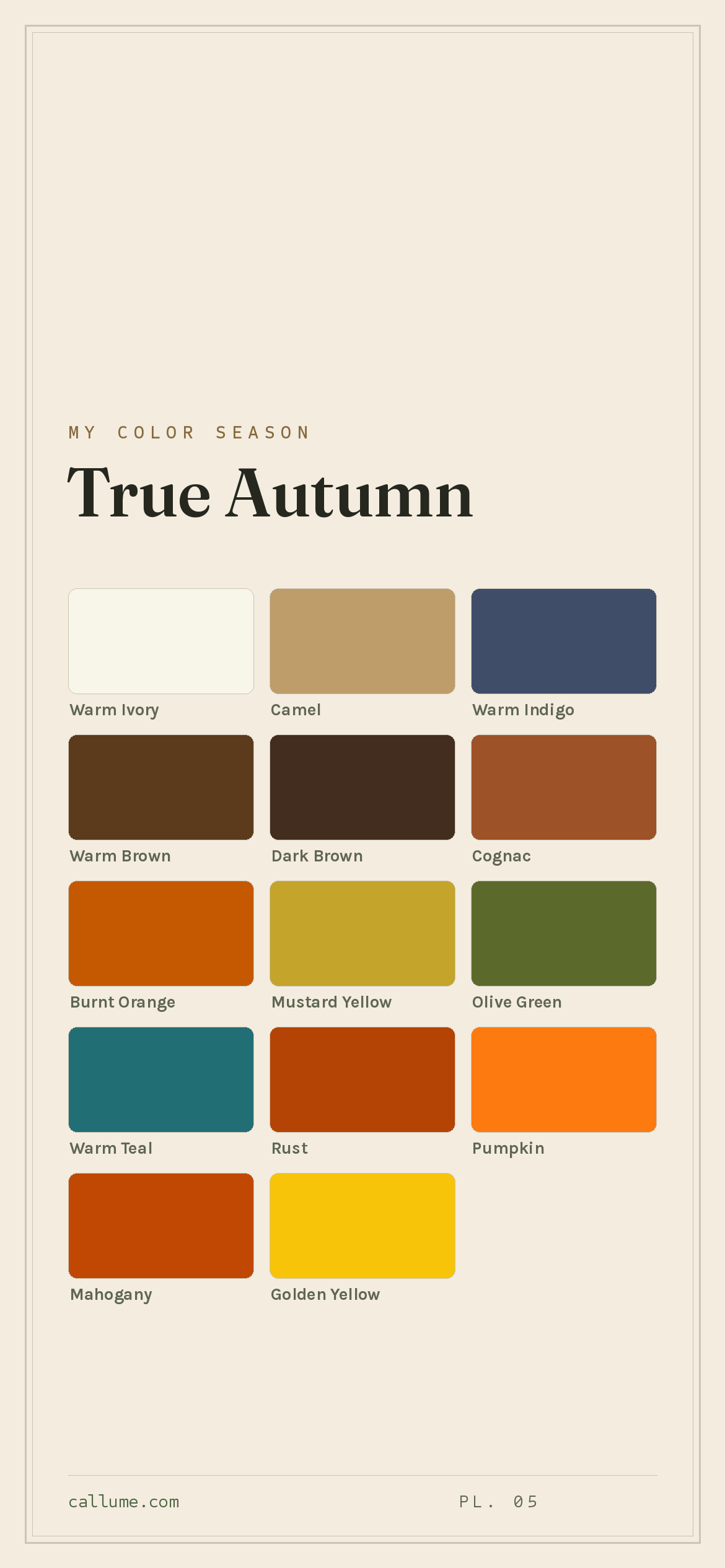
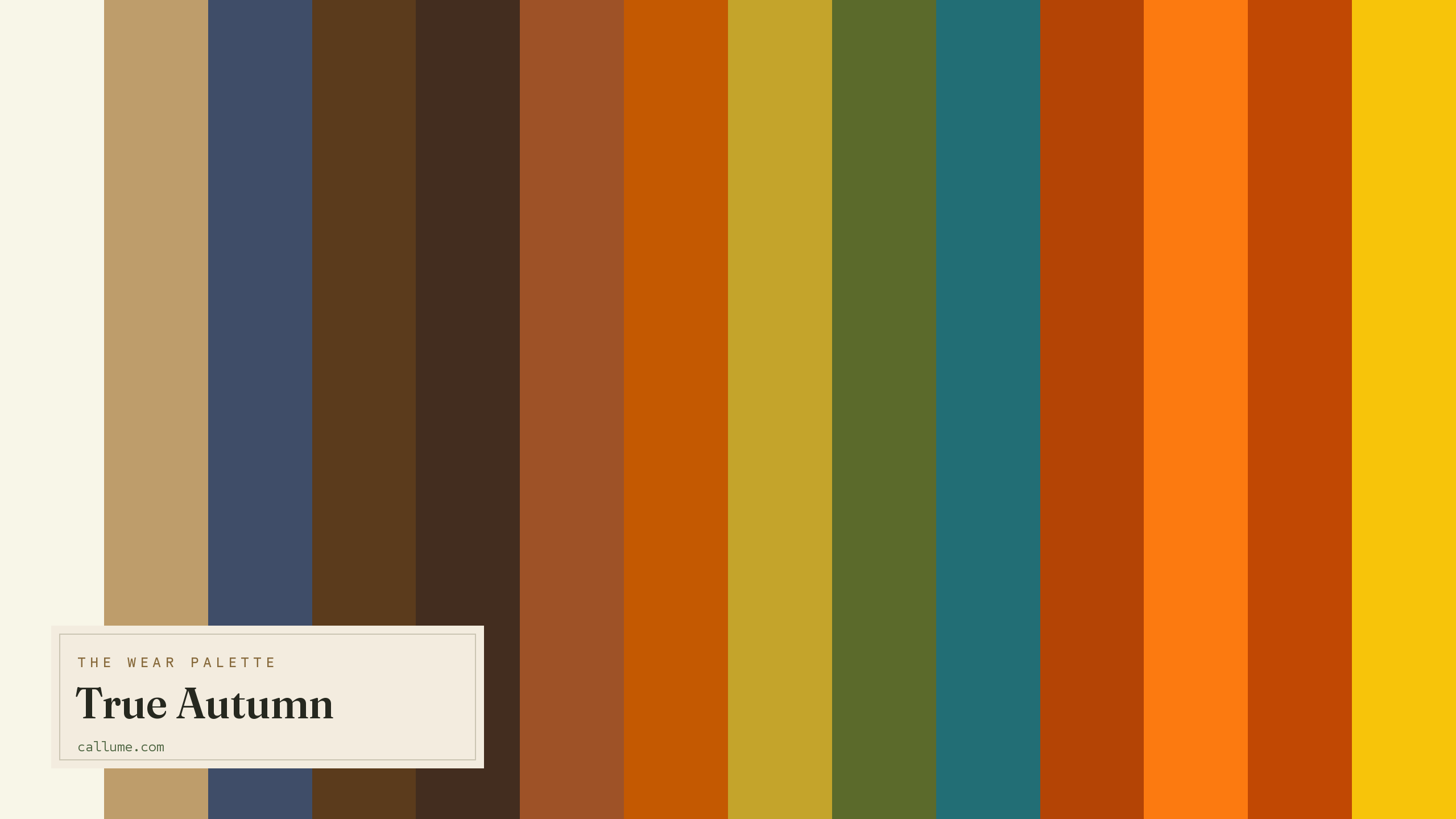
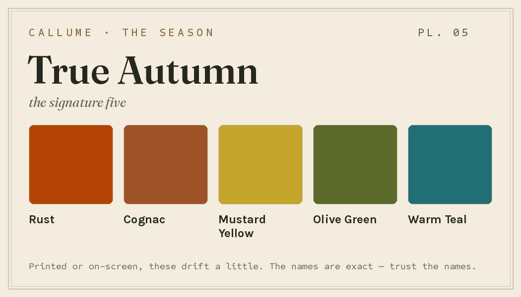
Every color by name
Every color a True Autumn can wear, by name. Tap one to copy its code.
Neutrals Core color StatementHex codes
For a moodboard, a design tool, or checking a shop listing.
- Warm Ivory#F8F6E8
- Camel#BE9D6B
- Warm Indigo#3F4D68
- Warm Brown#5B3B1C
- Dark Brown#432D1F
- Cognac#9E5227
- Burnt Orange#C45901
- Mustard Yellow#C4A42B
- Olive Green#5B6A2B
- Warm Teal#226E75
- Rust#B44405
- Pumpkin#FC7A10
- Mahogany#C14803
- Golden Yellow#F7C40A
What actually makes you a True Autumn
Your season is measured, not guessed: it comes from reading the real color of your skin, hair, and eyes once the light has been corrected. What stands out about you is warmth, and a lot of it. You sit at the warm end of the scale, with color that's rich but earthy rather than clear.
That golden warmth is why cool colors look so wrong on you and why gold jewelry always beats silver. It's also why your best colors have depth and spice rather than brightness. A clear, icy blue fights your skin; a warm teal or a rust settles right in.
- Weatherall & Coombs (1992), Skin color measurements in terms of CIELAB, the basis for reading warm-vs-cool undertone.
- Chardon, Cros & Bertin (1991), Skin colour typology and suntanning pathways, the Individual Typology Angle behind how depth is read.
- CIELAB (CIE L*a*b*), the perceptually-spaced color space the measurement works in.
Wearing it together
Colors from the deck above, dealt into hands — the move each pairing runs, and the mistake it dodges.
The neutral bridge: nearly the full value scale between two colors from the same warm family. You get black-and-white's hierarchy without importing its temperature fight.
An analogous run — gold into oxide into espresso, the season's signature gradient. Descending lightness does the organizing, so three rich colors never compete for the same job.
The complement move: the deck's one cool-leaning neutral anchoring its hottest color. Indigo is the counterweight that lets orange sing, so you never reach for a black that would go cold against you.
An echo: two oranges cut from the same ore, one vivid, one weathered. The value and saturation steps supply the structure, so it reads as tonal depth rather than a matching mistake.
Colors that fight a True Autumn
Cool is the enemy. Icy blues, cool pinks, and cool greys all fight your golden warmth and leave your skin looking grey. Pure black and pure white are too stark and too cold for your soft, earthy contrast. Fuchsia is the worst of both, cool and loud at once.
The depth dial
Depth is a dial, not a fork in the road. A True Autumn can be porcelain-fair or very deep and the verdict doesn't move — the golden warmth is the constant, and these fourteen colors are the deck at every rung. What changes as skin deepens is which colors lead against it: which brown does daily duty as your black, how much work Warm Ivory takes on, and which colors sit close enough to your own skin to blend rather than contrast. Same deck, different order of operations.
Camel, Pumpkin, and Mustard Yellow sit near your skin — tonal dressing is the move; Dark Brown anchors it.
Most colors sit near your skin; chroma does the work, Dark Brown and Warm Ivory hold the poles.
Warm Ivory becomes the wardrobe's biggest event; Dark Brown is your one working dark; everything else reads tonal.
Bold or quiet
If your features sit far apart — real distance between skin, hair, and eyes — spend the deck at its poles. Dark Brown against Warm Ivory is your column, Rust and Golden Yellow can run at full garment scale, and one clear value jump can organize the whole outfit. This deck rewards being worn boldly when the face can meet it.
If your coloring blends, the same deck works quieter. Lean on the colors that sit near your own skin — Camel, Cognac, a tonal run of Mustard Yellow into Rust — and dose the poles at collar and cuff instead of wearing them as blocks. Neither approach is a compromise; it's the same fourteen colors at different volume. The season picks your deck; contrast picks your weight.
True Autumn vs the seasons it's mistaken for
True Autumn's neighbors share its warmth but differ in strength and depth.
| True Autumn | Soft Autumn | Dark Autumn | |
|---|---|---|---|
| Undertone | clearly warm | gently warm | warm |
| Depth | medium | medium | deep |
| Clarity | soft | muted | medium |
| Contrast | moderate | low | fairly high |
Soft Autumn is the same earthy family with the warmth greyed down to dust. True Autumn keeps the fuller, richer saturation. If muted, gentle versions of these colors suit you better than full-strength rust and mustard, look at Soft Autumn.
Dark Autumn takes the same warm earth and drives it deeper and more dramatic, toward near-black. True Autumn stays in the golden middle. If deep burgundy and forest feel more like you than glowing rust and cognac, look at Dark Autumn.
What this page can't do is see you. This is True Autumn's standard deck — the colors arranged the way they work for most of the season's wearers. It can't tell you whether you're actually a True Autumn or one of its sisters, a line drawn on saturation and clarity that's a genuinely close call. It can't tell you which of these fourteen lead on your skin, or how hard your contrast lets you push the poles. Those aren't opinions to browse for; they're measurements. A page can hand you the deck — it takes a reading of your own coloring to deal it.
The line between the Autumns is subtle, and undertone and depth are both easy for a phone to misjudge. A read that corrects the light first is the honest tiebreaker. Free, one photo, about fifteen seconds.
Settle it with a free read →Questions
Both are warm and earthy; the difference is saturation. True Autumn wears rich, full-strength color like rust, cognac, and mustard. Soft Autumn is the same family greyed and gentled down to dust. If full-strength warm colors flatter you rather than overwhelm, you're likely True Autumn; if every color needs softening to sit right, lean Soft Autumn.
Warm, clearly so. You sit at the warm end of the scale, which is why gold jewelry beats silver every time and why cool, icy colors leave your skin looking grey. Your best colors are golden and earthy: rust, cognac, olive, warm teal.
Cool colors and stark ones. Icy blues, cool pinks, and cool greys fight your golden warmth; pure black and white are too cold and hard for your soft, earthy contrast. Reach for warm dark brown instead of black and warm ivory instead of white, and keep everything on the golden side.
Depth. True Autumn sits at a golden medium depth, glowing rather than dramatic. Dark Autumn drives the same warm earth tones deeper, toward near-black richness. If deep burgundy and forest green suit you more than bright rust and cognac, look at Dark Autumn.
The five signature True Autumn colors are Rust, Cognac, Mustard Yellow, Olive Green, and Warm Teal — the palette's shorthand. The full wear palette runs wider: every color is on this page as a named swatch with its hex code, grouped into neutrals, core colors, and statement colors, with free wallpaper and wallet-card downloads of the whole set.
On this page. Every color in the True Autumn wear palette is listed with its hex code below the specimen board, with a copy-all button, and the palette comes as a free phone wallpaper, desktop wallpaper, and printable wallet card. No sign-up, nothing to install.