The Dark Winter color palette.
A Dark Winter is cool and deep with high contrast: the darkest, most dramatic Winter. Your colors are rich and shadowed but still crystal-clear: burgundy, sapphire, emerald, forest green, all anchored by true black. Nothing warm or dusty suits you; depth is your headline, and it stays cool the whole way down. Black and stark white flatter you because your own coloring already carries that much drama.
Read my season freeThe palette
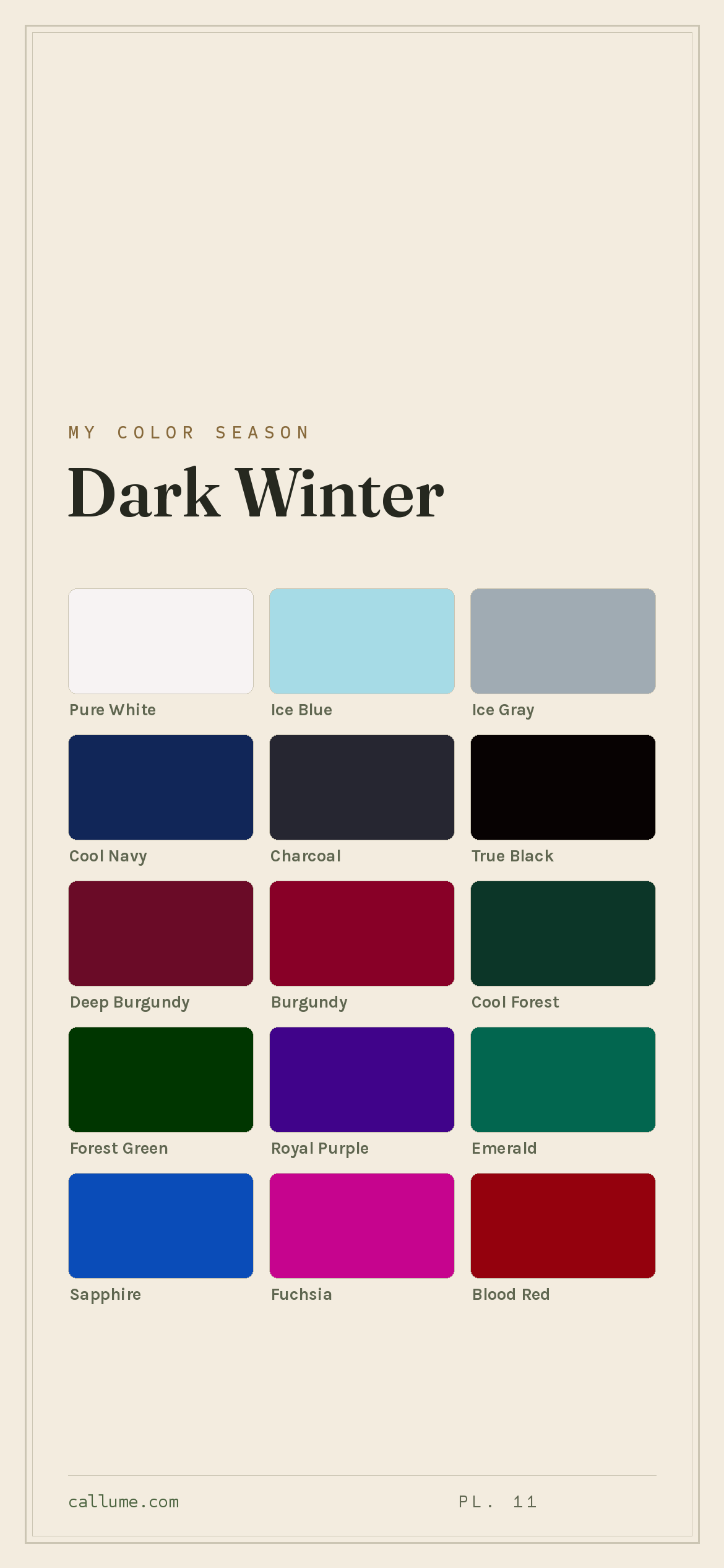
Dark Winter is the jewel box after dark: deep, cool color with the lights turned low. The brights read like gemstones in shadow, burgundy, sapphire, emerald, forest green, each one clear even at its darkest. Nothing here is warm and nothing is dusty. Your neutrals lean true black and cool navy over anything soft, and a single icy light (ice blue, icy violet) is all the brightness this palette needs.
Take the Dark Winter palette with you
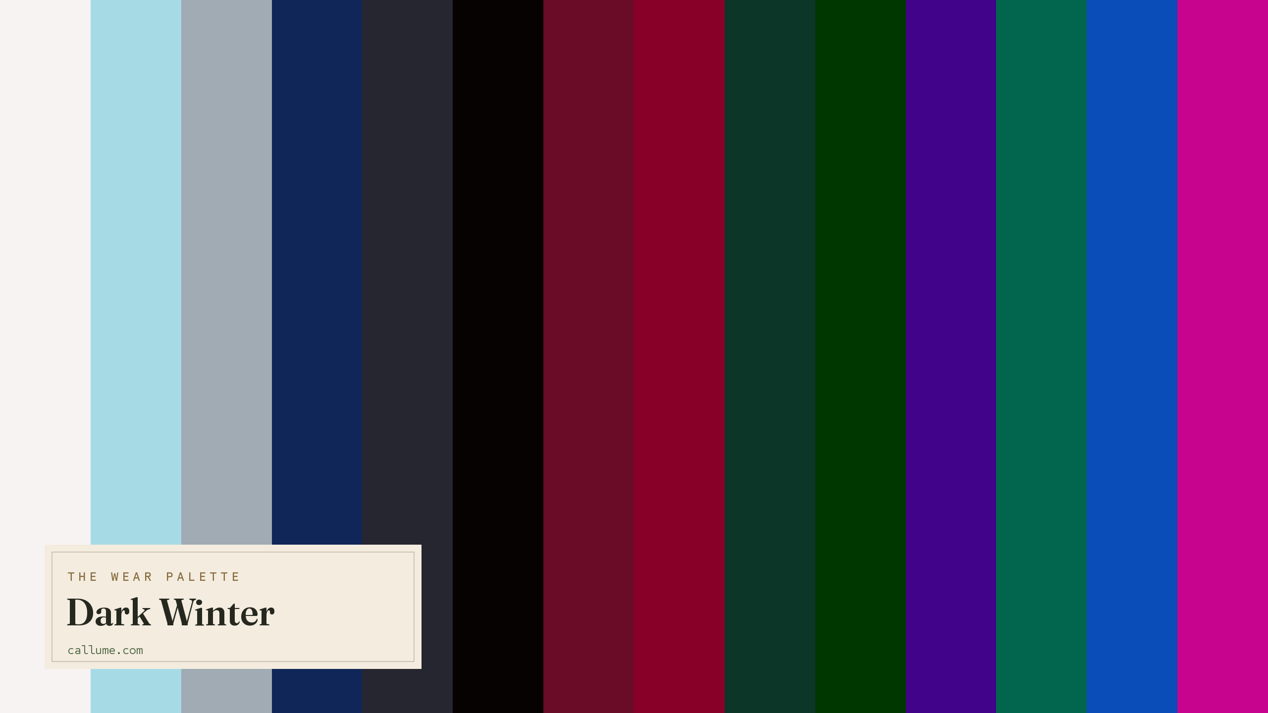
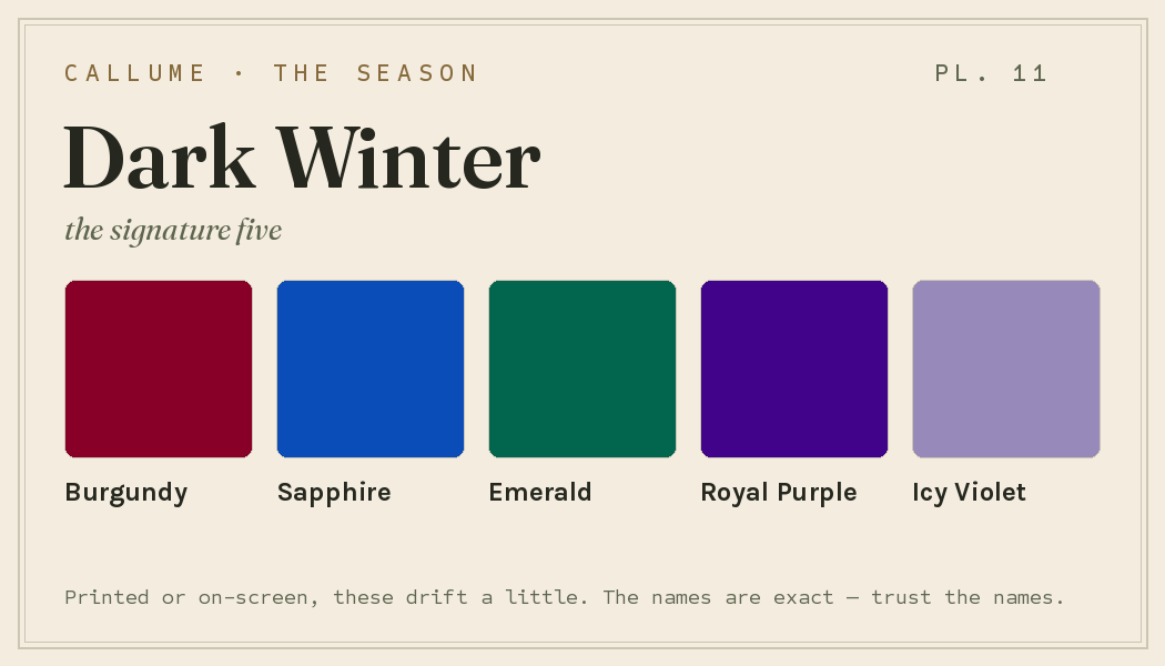
Free downloads, no sign-up: the Dark Winter palette as a lock screen, a desktop, and a wallet card that names its colors — names survive screens; the hexes live above when you need them.
Every color by name
Every color a Dark Winter can wear, by name. Tap one to copy its code.
Neutrals Core color StatementHex codes
For a moodboard, a design tool, or checking a shop listing.
- Pure White#F7F3F3
- Ice Blue#A6DBE6
- Ice Gray#A0ABB3
- Cool Navy#112658
- Charcoal#262631
- True Black#070202
- Deep Burgundy#6A0B27
- Burgundy#880027
- Cool Forest#0C3628
- Forest Green#003600
- Royal Purple#40038A
- Emerald#02664F
- Sapphire#0A4CB8
- Fuchsia#C6048E
- Blood Red#94010D
- Deep Teal#043538
- Icy Violet#978ABA
What actually makes you a Dark Winter
Your season isn't a guess. It comes from reading the real color of your skin, hair, and eyes once the room's light has been corrected for, since a warm bulb or a bright window quietly shifts every color in a photo. Two things stand out about you: your coloring runs deep, and underneath that depth you're cool.
That pairing sets the rules. Depth means light, airy colors have nothing to hold onto: a soft pastel floats right off your face. Being cool means warm earth tones (camel, warm brown, mustard) pull against your skin instead of grounding it. You want color that is dark, clear, and cool all at once, a burgundy or a deep teal that still reads sharp.
- Chardon, Cros & Bertin (1991), Skin colour typology and suntanning pathways, the Individual Typology Angle behind how depth is read.
- Weatherall & Coombs (1992), Skin color measurements in terms of CIELAB, the basis for reading warm-vs-cool undertone.
- CIELAB (CIE L*a*b*), the perceptually-spaced color space the measurement works in.
Wearing it together
Colors from the deck above, dealt into hands — the move each pairing runs, and the mistake it dodges.
A neutral bridge: the saturated wine reads luminous against a desaturated blue-grey anchor with a real value step underneath. It dodges this season's one true failure mode — a loud jewel destabilizing a muted colored neighbor — because charcoal is too quiet to fight back.
The founding pair with one jewel let in — a neutral bridge at maximum value contrast. The achromatic frame gives the sapphire nothing to compete with on the hue axis, dodging the vibration a saturated blue picks up against a muted colored dark.
A complement worn at matched depth: two opposed cool hues at equal jewel weight harmonize instead of vibrating. The failure mode dodged is saturation mismatch — put either next to something quieter and the louder one takes over the room.
An echo of cool temperature across a wide light-dark gap: the ice supplies the separation, the forest supplies the weight. It dodges the dark-on-dark collapse this deck courts when two deep pieces sit together with nothing light to hold the line.
Colors that fight a Dark Winter
None of these are bad colors. They just fight you. The warm ones (warm earth brown, camel, mustard, warm orange, peach) pull against your cool skin and turn it sallow. The pale, soft ones (beige, soft pastels) are the other trap: your coloring runs deep and clear, so anything light and hazy goes flat and drains your face with it.
The depth dial
Depth is a dial, not a door. Every Dark Winter — porcelain-fair through the deepest skin the wheel names — owns the same deck, because the season is set by cool undertone and high contrast, not by where the dial happens to sit. A tan changes your overtone, never your season. What moves is placement: which shelf of the deck earns the spot next to your face, and which does quiet work below the belt. Fair skin promotes the jewel mid-darks and saves true black for occasions; deep skin flips it, sending the icy lights up to the collar while black turns structural. Same twenty colors, different leads.
Charcoal, Cool Navy, and the jewel mid-darks lead; True Black is your occasion piece, not your everyday.
True Black goes everyday, and Burgundy, Forest Green, and Royal Purple sit at their most legible.
The poles lead: Pure White, Ice Blue, and Ice Gray at the face; True Black turns structural.
Bold or quiet
If your natural contrast runs high — near-black hair and iris against skin at any depth, the classic Dark Winter presentation — spend the deck at full strength. Hard breaks are your grammar: True Black against Pure White, Sapphire on an achromatic, Burgundy answering Emerald at matched depth. Keep the value gaps wide and the jewels fully saturated. Your face already carries that much drama; half-measures read as hesitation, not restraint.
The same deck also plays quieter. If your contrast sits lower, skip the hard white break for an Ice Gray one, run a near-monochrome column — Charcoal over Cool Navy — and let a single jewel, a Royal Purple sweater say, do the talking at garment scale. Nothing leaves the deck; the volume comes down while the colors stay put. That's the whole trick: your season picks the colors, your contrast picks the weight.
Dark Winter vs the seasons it's mistaken for
If you've been bounced around the Winters and Autumns, it's usually to one of these two. Each shares one of your two headline traits: one your cool clarity, the other your depth.
| Dark Winter | True Winter | Dark Autumn | |
|---|---|---|---|
| Undertone | cool, edging neutral | properly cool | warm |
| Depth | deep | medium | deep |
| Brightness | clear | clear, jewel-like | medium |
| Contrast | high | high | fairly high |
True Winter is the same cool clarity carried at medium depth, brighter and less shadowed than you. Its colors are jewel tones in full daylight where yours are jewel tones at dusk. If deep, commanding color suits you better than clear icy brights, you're on the Dark Winter side.
Dark Autumn shares your depth and drama but builds it on warmth: chocolate, olive, and golden amber instead of your cool burgundy and sapphire. If warm, earthy darks flatter you more than cool ones do, look at Dark Autumn.
One honest limit. This page describes Dark Winter's standard deck — the colors, the pairings, the placement logic that holds for the season as a whole. What it can't tell you is whether you're actually a Dark Winter rather than a True Winter one register lighter or a Dark Autumn one temperature warmer, which of these colors should lead against your particular skin, or how hard your own contrast lets you push the black-and-white breaks. Those aren't things a page can know; they're measurements — undertone, depth, contrast, read off your face once the light has been corrected. The deck is the map. Where you stand on it takes a reading.
Undertone is the slippery part here: whether you're cool or edging warm at this kind of depth. That's exactly what a phone's auto-settings tend to get wrong. If you're torn between Dark Winter and a neighbor, a read that corrects the light first is the honest tiebreaker. Free, one photo, about fifteen seconds.
Settle it with a free read →Questions
Both are deep and dramatic, so they get mixed up often. The difference is warmth: Dark Winter is cool all the way down, while Dark Autumn runs warm, with chocolate, olive, and golden amber. If cool burgundy, sapphire, and emerald flatter you, lean Dark Winter; if warm, earthy darks suit you better, lean Dark Autumn. Since warmth is the first thing a phone camera fudges, a light-corrected read is the most reliable way to know.
Cool, though edging toward neutral rather than icy. Warm colors like camel, chocolate, and mustard tend to pull against your skin and leave it looking sallow, while cool burgundy, sapphire, and forest green make it look clear. The headline for you is depth: your coloring is dark and clear at once, so light, hazy colors fade on you before warmth even comes up.
Depth. True Winter carries the same cool clarity at a medium depth, brighter and less shadowed than you. Dark Winter takes that clarity and deepens it into something commanding and dark, jewel tones at dusk rather than in daylight. If deep, dramatic color suits you better than clear icy brights, you're likely a Dark Winter, and a light-corrected read will confirm it.
Anything warm or pale. Warm earth brown, camel, mustard, and warm orange fight your cool skin, while beige, soft pastels, and peach go flat because your coloring wants depth and clarity. A soft pastel will float right off your face. Swap camel for a cool navy and any pastel for a true black or deep burgundy, and you'll see the difference straight away.
The five signature Dark Winter colors are Burgundy, Sapphire, Emerald, Royal Purple, and Icy Violet — the palette's shorthand. The full wear palette runs wider: every color is on this page as a named swatch with its hex code, grouped into neutrals, core colors, and statement colors, with free wallpaper and wallet-card downloads of the whole set.
On this page. Every color in the Dark Winter wear palette is listed with its hex code below the specimen board, with a copy-all button, and the palette comes as a free phone wallpaper, desktop wallpaper, and printable wallet card. No sign-up, nothing to install.