The True Summer color palette.
A True Summer is cool and soft at the same time: cool-toned coloring, but never icy or stark. The colors that suit you look faintly rained-on, like dusty rose, sea glass, cool raspberry, soft slate blue. You're the truest cool of the three Summer types, not as pale as a Light Summer and not as hazy as a Soft Summer. Silver sits right on you; gold and camel tend to leave you looking tired.
Read my season freeThe palette
True Summer colors look like they've been left out in soft, overcast light: cool, but gentle about it. Nothing is icy and nothing shouts. Picture the sea an hour before rain: dusty rose, sea glass, cool raspberry, soft slate blue. Your neutrals lean blue-grey and soft navy over hard black, and your colors stay muted enough to feel calm while still reading as color.
Take the True Summer palette with you
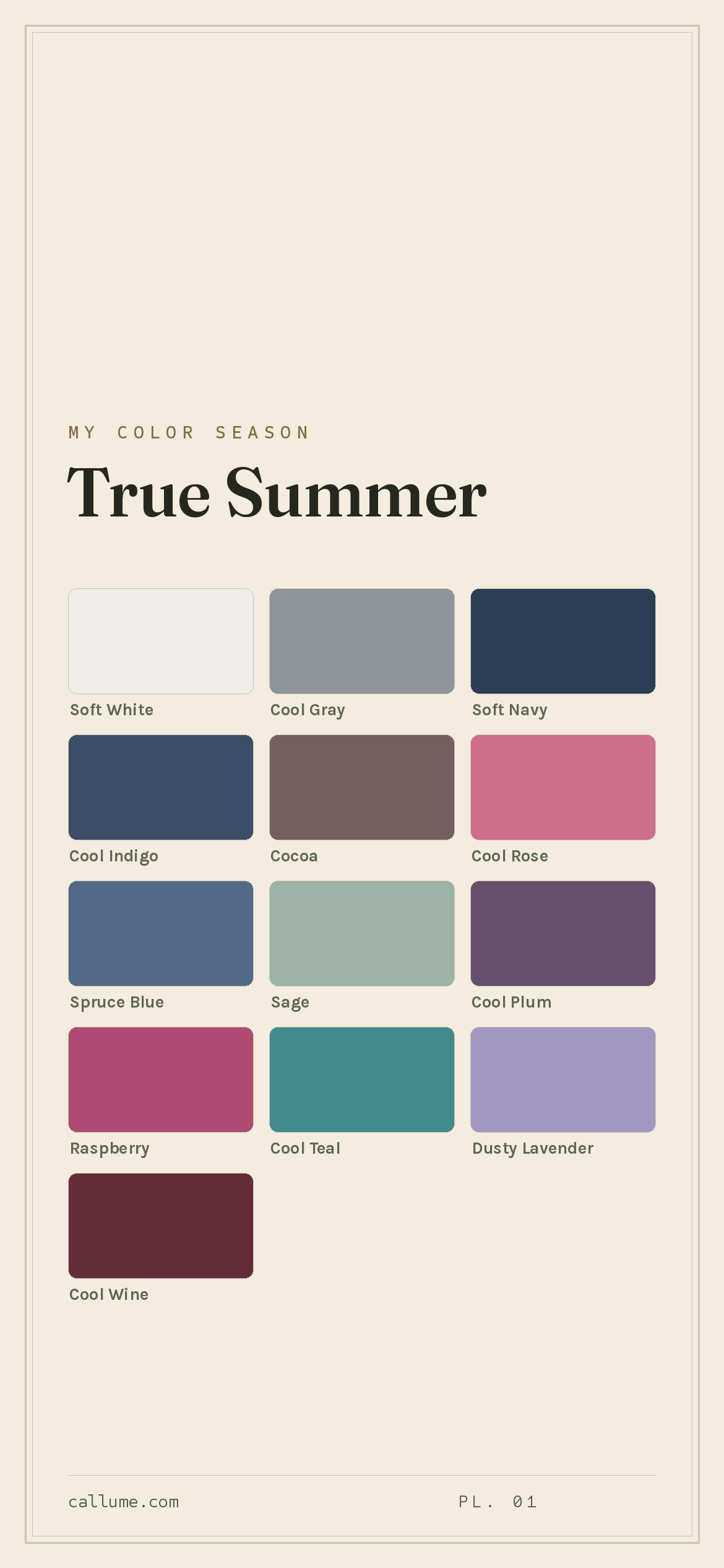
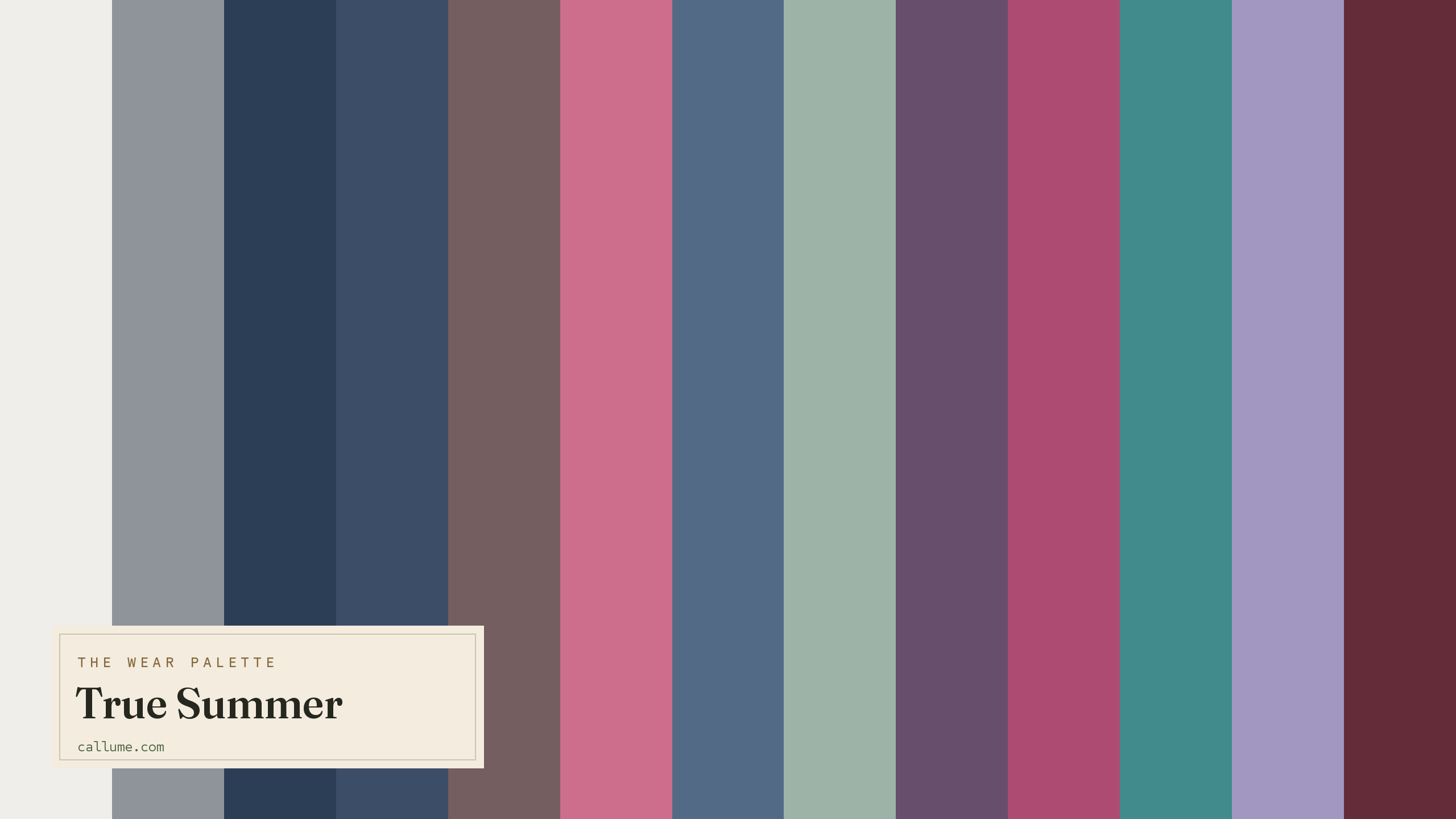
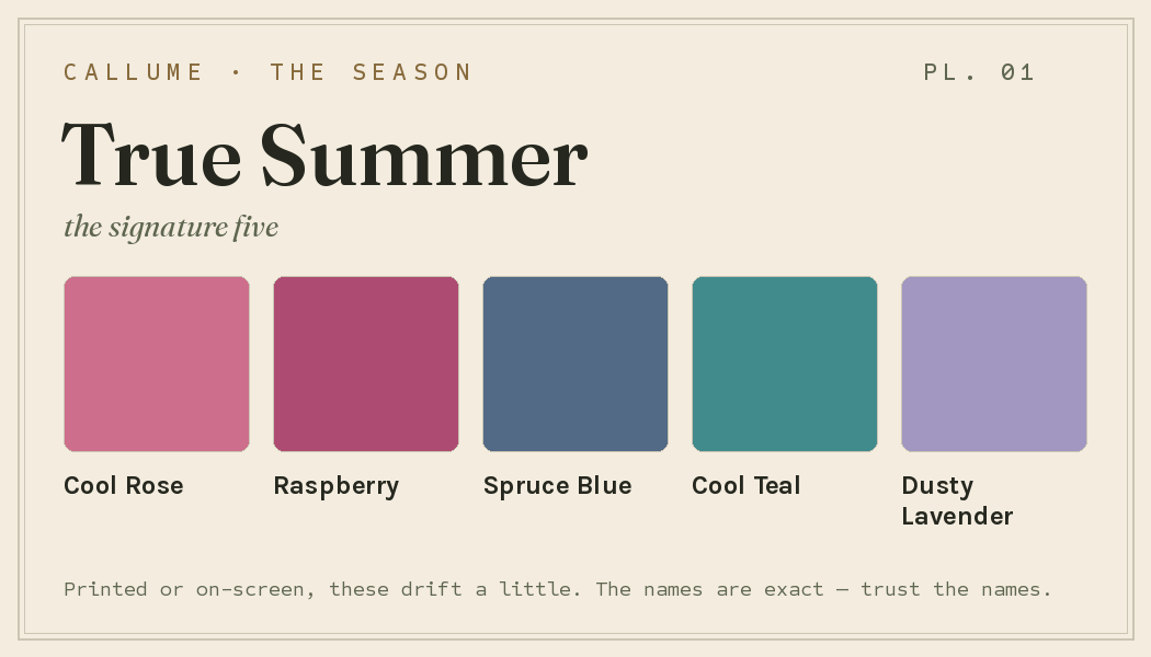
Free downloads, no sign-up: the True Summer palette as a lock screen, a desktop, and a wallet card that names its colors — names survive screens; the hexes live above when you need them.
Every color by name
Every color a True Summer can wear, by name. Tap one to copy its code.
Neutrals Core color StatementHex codes
For a moodboard, a design tool, or checking a shop listing.
- Soft White#F0EEEB
- Cool Gray#8F939A
- Soft Navy#2C3E56
- Cool Indigo#3C4D68
- Cocoa#745E5F
- Cool Rose#CD6E8C
- Spruce Blue#526A85
- Sage#9DB3A7
- Cool Plum#674E6D
- Raspberry#AE4B72
- Cool Teal#418B8D
- Dusty Lavender#A197C1
- Cool Wine#642C38
What actually makes you a True Summer
Most color advice is someone squinting at you and guessing; this is measured. Your season comes from reading the real color of your skin, hair, and eyes, but only after correcting for whatever light you were standing in, since a warm bulb or a bright window quietly shifts every color in a photo. With the light out of the way, one thing about you is clear: you're properly cool, and only softly muted.
That pairing explains everything. Being cool means warm colors like orange, gold, and camel pull against your skin instead of flattering it. Being soft means the coolness arrives gently, so clear icy brights are a touch much and dusty, watered-down colors feel like home. It's why you glow in a cool rose and go grey in a warm mustard.
- Weatherall & Coombs (1992), Skin color measurements in terms of CIELAB, the basis for reading warm-vs-cool undertone.
- Chardon, Cros & Bertin (1991), Skin colour typology and suntanning pathways, the Individual Typology Angle behind how depth is read.
- CIELAB (CIE L*a*b*), the perceptually-spaced color space the measurement works in.
Wearing it together
Colors from the deck above, dealt into hands — the move each pairing runs, and the mistake it dodges.
The season's widest value span at matched, quiet saturation — your version of black on white, with none of the harshness. It gives you clear hierarchy while dodging the flattening that pure black against pure white inflicts on soft coloring.
An analogous pair: the deck's clearest jewel over its softest brown-family neutral, undertones aligned. The big drop in saturation reads as deliberate layering rather than discord — the failure mode where a bright and a muted color fight for register.
Analogous cool hues with a wide value gap and matched moderate saturation — depth without collision. The value step does the work, so neither color has to shout to be seen.
A monochrome ladder — wine is rose's own deeper self, so the echo lands as one idea at two depths. The clean step down in value and saturation keeps it harmonious without going muddy, the usual fate of near-matched soft colors.
Colors that fight a True Summer
None of these are bad colors. They just fight you. The warm ones (orange, mustard, warm brown, camel, gold) pull against your cool skin and turn it sallow. Pure black and pure white are the other trap: your coloring is soft and low-key, so hard black-and-white flattens your face instead of framing it. Peach does both, warming and washing you out.
The depth dial
Depth is a dial, not a fork in the road: whether your skin is fair or deep, a True Summer is still cool first and soft second, and these thirteen colors are still the deck. What depth changes is which of them lead against your face and which drop back into supporting roles — the trouser, the coat, the collar. Soft Navy is 'your black' at every depth, but the job it does walks the whole ladder, from maximum-contrast anchor on fair skin to a near-echo of the skin itself on the deepest. Nothing ever leaves the palette; it just gets reseated.
The dark pole leads: Soft Navy, Cool Indigo, and Cool Wine carry the contrast; Soft White frames easily.
The hinge depth. Cool Teal becomes a signature near-tonal move; Soft White shrinks to collar-and-cuff doses.
Soft White becomes the hardest-working color you own; Cool Indigo is the darkest that still shows. Raspberry holds.
Bold or quiet
A higher-contrast True Summer spends the deck at its full span. Lean on the Soft Navy and Soft White axis — the widest gap the season owns — and let the clear jewels, Raspberry and Cool Rose, sit near the face at real size rather than accent scale. Even here there's a ceiling: this palette has no true poles, so the hardest break it can make is still a graduated one. That's not a limitation so much as the season's signature — strong, but never stark.
A lower-contrast wearer of the exact same deck goes tonal instead. Build columns — Soft Navy into Spruce Blue into Cool Gray, or Cool Wine under Cool Rose — where each step is a shade, not a leap, and let one color do most of an outfit's work. The colors don't change and neither does the season; the same Raspberry just arrives as a scarf instead of a sweater. The deck is fixed. Your contrast picks your weight.
True Summer vs the seasons it's mistaken for
If a quiz has ever bounced you between True Summer and a neighbor, it's almost always one of these two, and the difference is smaller than it sounds.
| True Summer | Soft Summer | Light Summer | |
|---|---|---|---|
| Undertone | properly cool | cool, hint of warmth | cool |
| Depth | medium | medium | light, airy |
| Softness | soft | softer, greyer | soft |
| Contrast | moderate | low | low |
Soft Summer is the hazier cousin. It trades a little of the cool for grey and a whisper of warmth, so its best colors are rose-beige, soft mauve, and smoky blue. If clear cool rose and raspberry flatter you more than those foggy neutrals do, you're on the True Summer side.
Light Summer is the same cool coloring turned right down: paler, softer, lower in contrast. If the palette here ever feels a shade too strong, like the colors are wearing you instead of the other way around, that's the one to look at.
Everything on this page is True Summer's standard deck — the season's colors, arranged the way the season generally wears them. What the page can't tell you is whether you're actually a True Summer rather than a Soft Summer or a Light Summer, since those lines come down to undertone and softness calls that are genuinely close. It also can't say which of these thirteen lead on your particular skin, or how much contrast your own coloring licenses — those are measurements, not descriptions. A calibrated read answers all three from one photo, and it's the difference between wearing a season's averages and wearing your own numbers.
Warmth is the one thing a phone camera guesses at, and often gets wrong. If you're stuck between True Summer and a neighbor, the honest tiebreaker is a read that corrects the light first. Free, one photo, about fifteen seconds.
Settle it with a free read →Questions
This is the most common mix-up, and it comes down to one thing: warmth. A True Summer is properly cool. A Soft Summer keeps most of that cool but adds a bit of grey and a hint of warmth, so it leans toward rose-beige, soft mauve, and smoky neutrals. If clear cool rose and raspberry light you up, lean True Summer; if the hazier, greyed colors suit you better, lean Soft Summer. It's easy to get wrong because that deciding factor, warmth, is the first thing a phone camera fudges, so a light-corrected read is the surest way to settle it.
Cool, the coolest of the three Summers. That's why warm colors like gold, orange, and camel tend to leave you looking a little tired or sallow, while cool rose, soft raspberry, and slate blue make your skin look clear and rested.
Warm colors and hard ones. Orange, mustard, warm brown, camel, and yellow gold fight your cool skin; pure black and pure white are too heavy for your soft, low-key contrast and end up flattening your face instead of framing it. Swap black for a soft navy and stark white for a creamy off-white and you'll see the difference straight away.
Lightness. Light Summer is the same cool coloring turned right down, paler, softer, and lower in contrast. Both are cool, so if the True Summer colors ever feel a touch too strong or saturated on you, Light Summer is the neighbor worth checking.
The five signature True Summer colors are Cool Rose, Raspberry, Spruce Blue, Cool Teal, and Dusty Lavender — the palette's shorthand. The full wear palette runs wider: every color is on this page as a named swatch with its hex code, grouped into neutrals, core colors, and statement colors, with free wallpaper and wallet-card downloads of the whole set.
On this page. Every color in the True Summer wear palette is listed with its hex code below the specimen board, with a copy-all button, and the palette comes as a free phone wallpaper, desktop wallpaper, and printable wallet card. No sign-up, nothing to install.