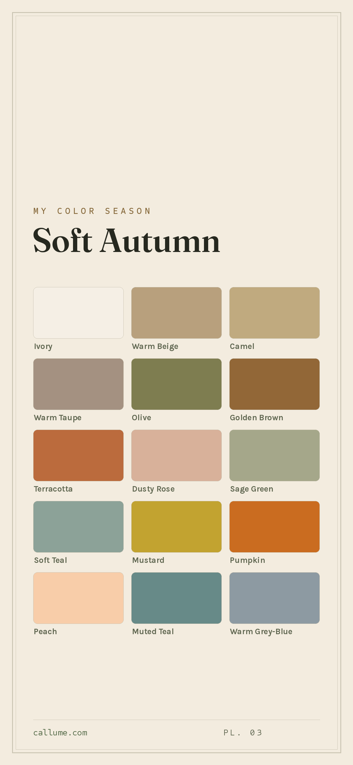
The Soft Autumn color palette.
A Soft Autumn is muted and gently warm: dusty, earthy coloring with a quiet golden glow. Your colors look like autumn seen through a little haze: terracotta, sage, camel, soft teal, dusty rose. Softness is the main event, not the warmth, which is why Soft Autumn is so often mistaken for its cool cousin, Soft Summer.
Read my season freeThe palette
Soft Autumn is the muted-earth palette: warm, but so gentle about it that nothing shouts. Everything looks a little sun-faded: terracotta, sage, camel, dusty rose, a soft grey-green teal. Your neutrals do most of the work (ivory, camel, warm taupe, olive), and even your boldest colors come softened. Nothing jumps out; it all just settles.
Take the Soft Autumn palette with you
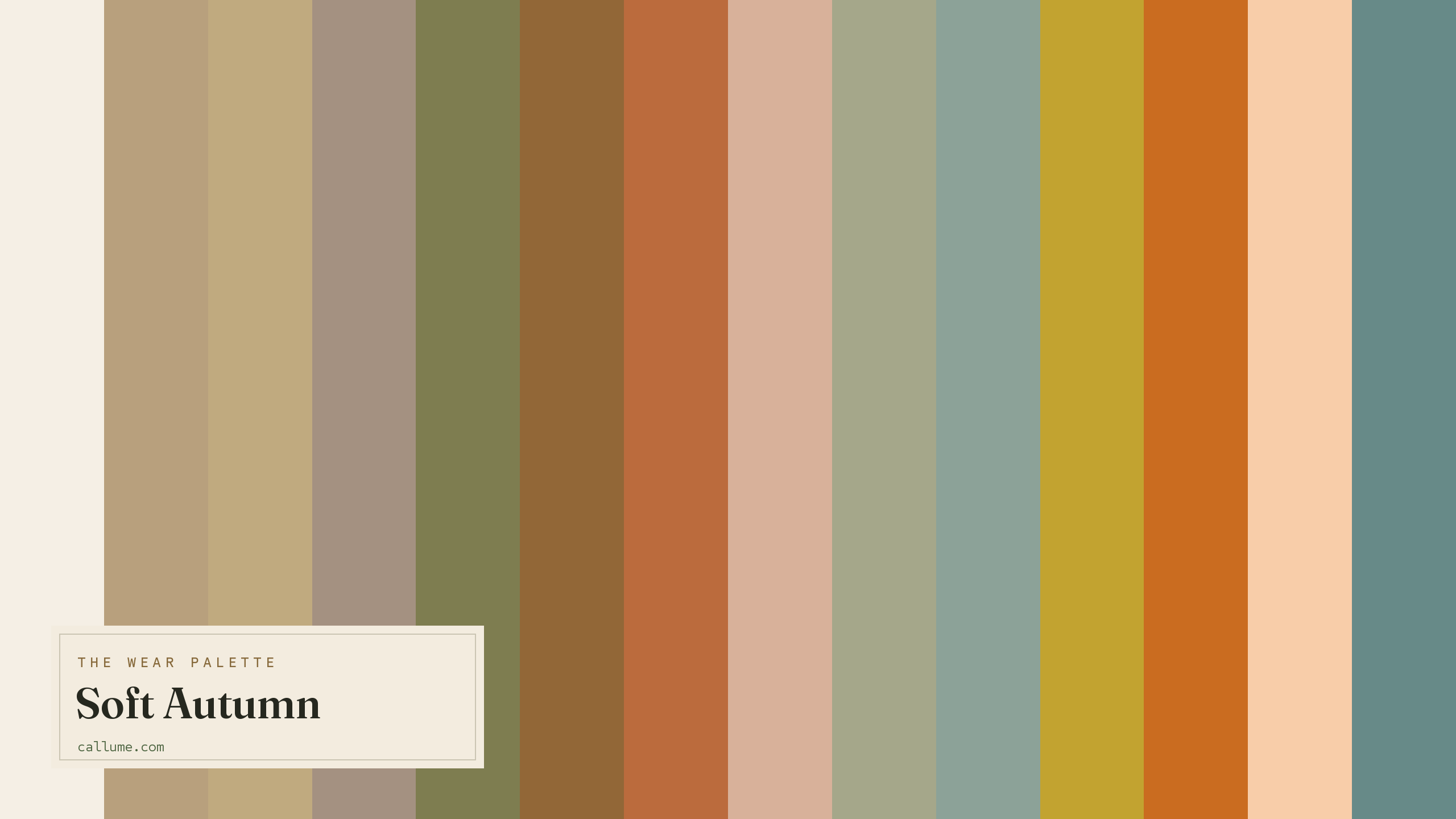
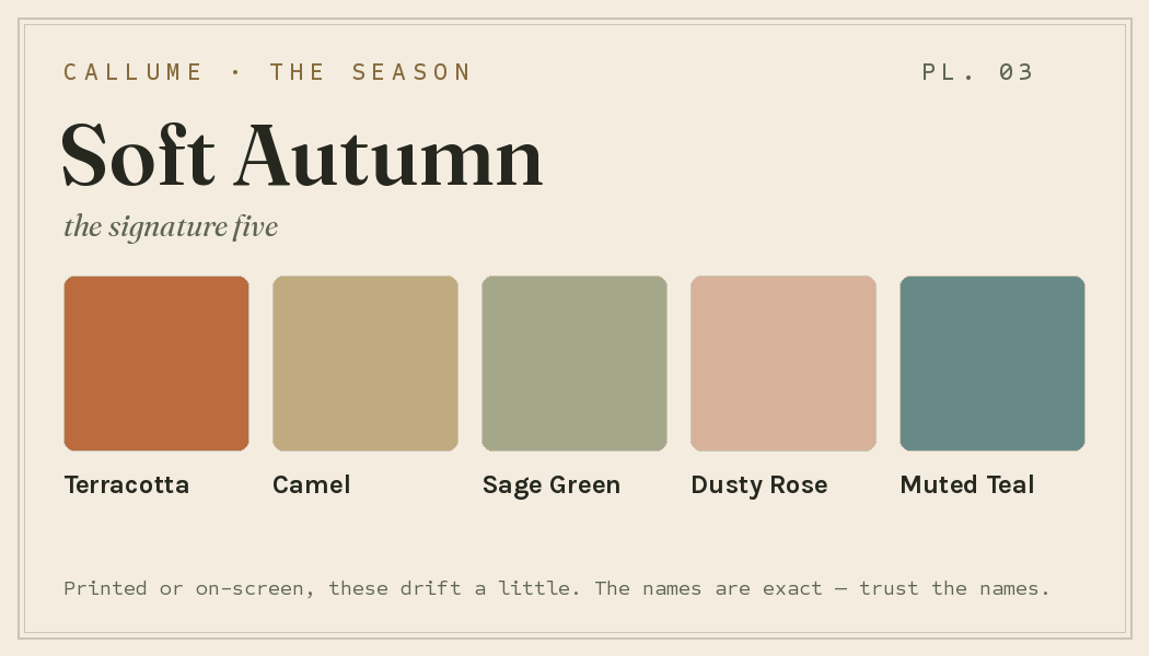
Free downloads, no sign-up: the Soft Autumn palette as a lock screen, a desktop, and a wallet card that names its colors — names survive screens; the hexes live above when you need them.
Every color by name
Every color a Soft Autumn can wear, by name. Tap one to copy its code.
Neutrals Core color StatementHex codes
For a moodboard, a design tool, or checking a shop listing.
- Ivory#F5EFE5
- Warm Beige#B8A07D
- Camel#C0AA7F
- Warm Taupe#A49181
- Olive#7E7D50
- Golden Brown#926737
- Terracotta#BB6B3D
- Dusty Rose#D8B19A
- Sage Green#A5A78A
- Soft Teal#8CA298
- Mustard#C2A330
- Pumpkin#CA6C20
- Peach#F8CDA9
- Muted Teal#678A88
- Warm Grey-Blue#8D9AA2
What actually makes you a Soft Autumn
Your season is measured, not guessed: it comes from reading the real color of your skin, hair, and eyes once the room's light has been corrected for. And the headline for you isn't "warm," it's "soft." Everything about your coloring is gentle and low-contrast, your features blending together rather than standing apart.
The warmth is real but quiet, just enough to tip you toward autumn instead of summer. That's why the name leads with "Soft." It's also why hard or icy colors feel like a stranger walked into the room; they carry a sharpness your coloring doesn't.
- CIELAB (CIE L*a*b*), the perceptually-spaced color space the measurement works in.
- Weatherall & Coombs (1992), Skin color measurements in terms of CIELAB, the basis for reading warm-vs-cool undertone.
- CIEDE2000, the perceptual color-distance formula used to score you against each season.
Wearing it together
Colors from the deck above, dealt into hands — the move each pairing runs, and the mistake it dodges.
The foundation echo: two warm earths in quiet agreement, with enough of a value step between them to build an outfit instead of a blur. This is the move that dodges the muted palette's one real trap — everything soft, nothing separated.
The season's signature warm-cool handshake — nearly complementary hues, held stable because both are equally muted and sit at similar depth. Matched softness turns what would be a clash into depth.
True complements, kept civil by a clear light-dark gap and matched desaturation — the saturation fight that ruins most complement pairs never starts. The deck's best quiet drama.
A neutral bridge: taupe and ivory frame terracotta so its warmth reads as the point rather than a shout. Without that low-chroma ground, the deck's boldest earth tone is left carrying the outfit alone — the classic unanchored-statement mistake.
Colors that fight a Soft Autumn
Everything clear and everything hard works against you. Pure black and pure white are too stark for your gentle, low-contrast face; they read like a door slamming. Icy pastels and neons are the opposite problem with the same result: against your soft coloring, a fuchsia or a neon green looks like it belongs to someone else. Even a clean royal blue is too sharp to sit quietly next to you.
The depth dial
Depth is a dial, not a fork in the road. Whether your skin is fair or deep, a Soft Autumn's deck never changes — same seventeen muted earths, same warm undertone, same avoid list. What changes is which colors lead against your skin and which fall back to supporting roles. Ivory is the clearest example: it is your white at every depth, but on fair skin it blends in quietly, while on deep skin it becomes the single loudest thing you can wear. The deck holds still; your skin decides the casting.
Half the deck nearly matches your skin. Blending is the native move; olive and golden brown do the anchoring.
Ivory carries the contrast. Olive plays your black; near-skin colors like warm taupe read on hue alone.
The whole deck sits light of you. Olive and terracotta lead; ivory becomes the statement, dosed deliberately.
Bold or quiet
If your features carry more contrast than most Soft Autumns, spend the deck at its poles. Put ivory directly against olive or golden brown, let terracotta or pumpkin take a full garment, and build outfits on clear light-against-dark steps rather than gentle drifts. You are still working muted colors — that part never changes — but you can afford the deck's widest gaps, and the outfit will hold its shape at a distance.
If your contrast runs low, the same seventeen colors want a quieter arrangement. Keep neighboring values together — camel with warm beige, sage green with warm taupe — and let texture do the separating that value contrast would: brushed wool against suede, matte knit against linen. Statement colors move to accent scale, a scarf rather than a coat. Same deck, different volume. The colors are settled by your undertone; contrast picks your weight.
Soft Autumn vs the seasons it's mistaken for
Your two neighbors sit on either side of you: one shares your softness, the other your warmth. The Soft Summer mix-up is the most common one in all of color analysis, and it's worth understanding why.
| Soft Autumn | Soft Summer | True Autumn | |
|---|---|---|---|
| Undertone | gently warm | gently cool | clearly warm |
| Depth | medium | medium | medium |
| Softness | very soft | very soft | soft |
| Contrast | low | low | moderate |
What trips everyone up is how much the two share. On depth, softness, and contrast, Soft Autumn and Soft Summer come out the same. The only real difference is warmth: you lean gently warm, Soft Summer leans gently cool. That's it. And warmth is the one thing a phone camera is most likely to get wrong, which is why these two get swapped more than any other pair.
True Autumn is the richer, full-strength version of the same earthy family, with deeper golds and stronger color. Soft Autumn is that palette gentled and greyed down. If full-strength terracotta and teal flatter you rather than overwhelm, you might be True Autumn.
One honest caveat: this page shows Soft Autumn's standard deck, and a page can only take you so far. It cannot tell whether you are actually a Soft Autumn or one of its close sisters — Soft Summer shares everything but the warmth, and the golden-versus-rose call is genuinely hard to eyeball. It cannot tell which of these colors lead on your particular skin, or how bold your own contrast lets you go. Those are measurements, not vibes, and they come from reading your coloring directly rather than from a chart. Until then, treat this deck as the map, not the territory.
Soft Autumn and Soft Summer come down to one slippery thing: warmth. That makes this the best possible case for a read that corrects the light before it judges your color. Free, one photo, about fifteen seconds.
Settle it with a free read →Questions
This is the most common mix-up in color analysis. On nearly everything (softness, depth, contrast) the two are basically the same. The only real difference is warmth: Soft Autumn leans gently warm, Soft Summer gently cool. If warm camel and gold flatter you, lean Soft Autumn; if rose-grey, soft mauve, and silver suit you better, lean Soft Summer. Since the deciding factor is the exact thing a phone camera fudges, a light-corrected read is the most reliable way to know.
Warm, but only gently. The warmth is quiet, about half of what a True Autumn carries, and softness is really the dominant note in your coloring. It's just enough to tip you toward autumn rather than summer, which is why the name leads with "Soft."
Anything clear or hard. Pure black and pure white overpower your gentle, low-contrast face; icy blues, neon greens, fuchsia, and hot pink are far too sharp for your soft coloring and end up looking like they belong to someone else. Even a clean royal blue is too much. Reach for deep olive or golden brown instead of black, and ivory instead of stark white.
Strength. True Autumn is the richer, more saturated, more clearly golden version of the same earthy family. Soft Autumn is that palette gentled and greyed down. If full-strength terracotta and teal flatter you rather than overwhelm you, look at True Autumn; if every color needs softening to sit right, you're likely Soft Autumn.
The five signature Soft Autumn colors are Terracotta, Camel, Sage Green, Dusty Rose, and Muted Teal — the palette's shorthand. The full wear palette runs wider: every color is on this page as a named swatch with its hex code, grouped into neutrals, core colors, and statement colors, with free wallpaper and wallet-card downloads of the whole set.
On this page. Every color in the Soft Autumn wear palette is listed with its hex code below the specimen board, with a copy-all button, and the palette comes as a free phone wallpaper, desktop wallpaper, and printable wallet card. No sign-up, nothing to install.