The Soft Summer color palette.
A Soft Summer is muted and cool, with a soft watercolor quality: dusty, blue-grey tones that never quite come to full strength. Your best colors look like they've been washed a few times, like dusty rose, soft mauve, powder blue, sage. Softness leads and coolness follows, which is why Soft Summer is so often confused with its warm twin, Soft Autumn.
Read my season freeThe palette
Soft Summer is muted color on a cool, blue-grey base. Everything is gentle and a little smoky, like a watercolor left to dry. Dusty rose, soft mauve, powder blue, sage green: none of them shout, and none of them are warm. Your neutrals are cool greys and soft navy rather than beige, and even the deeper colors stay hushed.
Take the Soft Summer palette with you
Free downloads, no sign-up: the Soft Summer palette as a lock screen, a desktop, and a wallet card that names its colors — names survive screens; the hexes live above when you need them.
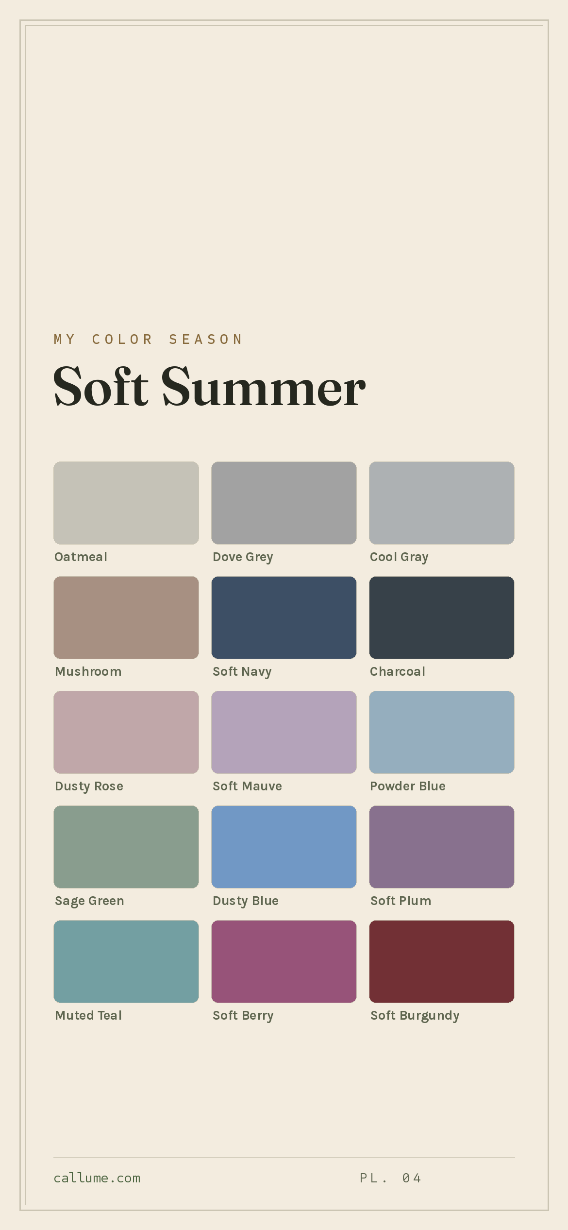
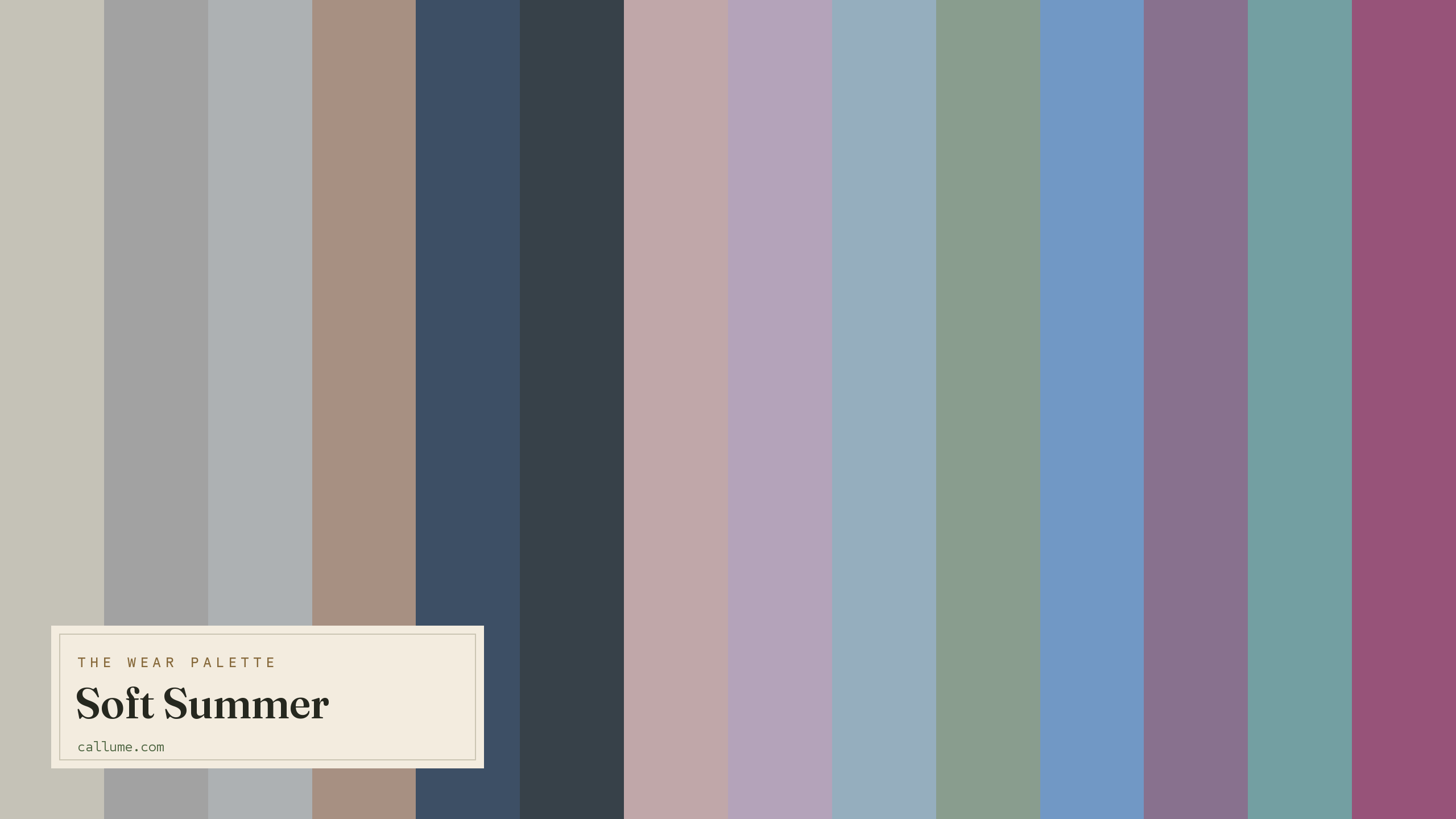
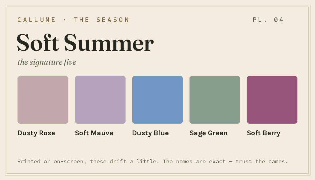
Every color by name
Every color a Soft Summer can wear, by name. Tap one to copy its code.
Neutrals Core color StatementHex codes
For a moodboard, a design tool, or checking a shop listing.
- Oatmeal#C5C2B7
- Dove Grey#A2A2A2
- Cool Gray#ADB1B3
- Mushroom#A79082
- Soft Navy#3D4F65
- Charcoal#374149
- Dusty Rose#C0A7A9
- Soft Mauve#B4A3BA
- Powder Blue#95AEBE
- Sage Green#899D8E
- Dusty Blue#7198C5
- Soft Plum#88718E
- Muted Teal#739FA2
- Soft Berry#975379
- Soft Burgundy#723035
- Muted Plum#806686
What actually makes you a Soft Summer
Your season is measured, not guessed: it comes from reading the real color of your skin, hair, and eyes once the light in your photo has been corrected. The headline for you is softness. Everything about your coloring is low-contrast and gentle, your features melting into each other rather than standing out.
The coolness is real but it plays second fiddle to the muting. That order matters: you're soft first, cool second, which is what keeps you in Summer rather than tipping you warm. It also explains why clear or bright colors feel wrong on you. They carry an edge your coloring doesn't have, and they end up wearing you.
- CIELAB (CIE L*a*b*), the perceptually-spaced color space the measurement works in.
- Weatherall & Coombs (1992), Skin color measurements in terms of CIELAB, the basis for reading warm-vs-cool undertone.
- CIEDE2000, the perceptual color-distance formula used to score you against each season.
Wearing it together
Colors from the deck above, dealt into hands — the move each pairing runs, and the mistake it dodges.
An echo: Powder Blue is Soft Navy's lighter self, so the pair reads as one blue at two depths. It buys real contrast without reaching for black, the hard pole this palette deliberately doesn't own.
A muted complement: warm mushroom against cool plum, both greyed down to the same register. The matched muting is what keeps opposites feeling sophisticated instead of turning into a fight.
A neutral bridge: Powder Blue and Soft Mauve sit at nearly the same weight, and side by side two gentle colors with no value order just blur. Dove Grey worn between them gives each its own ground.
Analogous: rose drifting into mauve, the same smoke laid over neighboring hues. It gets you color-on-color interest without borrowing a clear bright that would shout over everything else you're wearing.
Colors that fight a Soft Summer
Anything clear, warm, or hard works against you. Pure black and pure white are too stark for your low contrast and swallow your face. Bright and neon colors like fuchsia, neon green, and bright orange are far too loud for such muted coloring. And warm earth tones like camel and warm brown pull against your cool base, turning your skin sallow.
The depth dial
Depth is a dial, not a fork in the road. A fair Soft Summer and a deep Soft Summer wear the same deck — the same greyed roses and smoked blues, the same brushed silver, the same quiet register — because depth never changes the season, only the geography inside it. What the dial actually moves is which colors sit close to your skin and which sit far, and therefore which ones lead. And because this whole palette lives in the middle of the value range, that flip is more dramatic here than almost anywhere else: the color doing quiet everyday work at one depth becomes the statement at another. The signature migrates — Sage Green leading at lighter depths, Soft Plum in the middle, Soft Navy taking over at depth — while the season itself never moves an inch.
Charcoal, Soft Navy, and Soft Burgundy become your anchors; the rest of the deck sits close, watercolor-style.
Soft Plum echoes your depth almost exactly; Soft Navy anchors with ease; Oatmeal becomes a deliberate light beat.
The darks sit near your face — the native tonal move here; Oatmeal and Cool Gray carry the contrast.
Bold or quiet
If your features carry real contrast — dark hair against lighter skin, eyes that read sharp from across a room — you get to spend this deck at its widest. Charcoal against Oatmeal is the palette's one full value statement; Soft Navy under Powder Blue does the same work in blue. Soft Berry and Soft Burgundy are yours at garment weight, a whole sweater rather than a scarf. The colors themselves stay hushed; it's the spans between them that do the talking.
If your coloring runs quieter, the same deck plays legato. Neighboring values instead of wide jumps, tonal columns, Dove Grey slipped between two colors that would otherwise blur into each other — the slow fade is this season's native move, and low-contrast wearers are the ones it was written for. Soft Berry stays an accent: one note, placed near the face, and done. Neither way of wearing it is a downgrade, and neither deck is different. Contrast picks your weight.
Soft Summer vs the seasons it's mistaken for
Soft Summer sits between its warm twin and its cooler, clearer cousin. The Soft Autumn mix-up is one of the most common in color analysis, and the reason is worth seeing.
| Soft Summer | Soft Autumn | True Summer | |
|---|---|---|---|
| Undertone | gently cool | gently warm | properly cool |
| Depth | medium | medium | medium |
| Softness | very soft | very soft | soft |
| Contrast | low | low | moderate |
On depth, softness, and contrast, Soft Summer and Soft Autumn are the same. The only thing that separates them is undertone: you lean cool, Soft Autumn leans warm. If rose-grey, soft mauve, and silver flatter you, you're on the Soft Summer side; if camel, terracotta, and gold suit you better, it's Soft Autumn. Because undertone is exactly what a phone camera gets wrong, this pair gets swapped more than any other.
True Summer is cooler and a little clearer, with more contrast to its features. Soft Summer is muted first, greyer and quieter. If clear cool rose reads better on you than a dusty, smoked-down version, look at True Summer.
One honest caveat before you build anything on this page. What's here is Soft Summer's standard deck — the season's colors as they exist before anyone in particular puts them on. It can't tell you whether you're actually a Soft Summer rather than a Soft Autumn or a True Summer, which of these colors sit closest to your own skin and get to lead, or how wide a span your contrast really licenses. Those aren't things a page can intuit from the outside; they're measurements. The deck is the map. Where you stand on it takes a reading.
Soft Summer and Soft Autumn come down to one thing, undertone, and it's the single hardest thing for a phone to judge. A read that corrects the light first is the real tiebreaker. Free, one photo, about fifteen seconds.
Settle it with a free read →Questions
This is one of the most common mix-ups in color analysis, and for good reason. Soft Summer and Soft Autumn are the same on depth, softness, and contrast; the only difference is undertone. Soft Summer is gently cool, Soft Autumn gently warm. If rose-grey, soft mauve, and silver flatter you, lean Soft Summer; if camel, terracotta, and gold suit you better, lean Soft Autumn. Since undertone is the exact thing a phone camera fudges, a light-corrected read is the most reliable way to know.
Cool, but softly. Muting is the dominant quality in your coloring, and the coolness sits underneath it. That's why silver and rose-grey suit you while warm camel and gold turn your skin a little sallow.
Anything clear, bright, or warm. Pure black and white overpower your low contrast; fuchsia, neon green, and bright orange are far too loud for muted coloring; camel and warm brown fight your cool base. Reach for dusty rose, soft mauve, powder blue, and sage instead, and keep every color a little greyed.
Order of operations. True Summer is cool first, with clearer color and a touch more contrast. Soft Summer is muted first, greyer and lower-contrast. Both are cool, so if the Soft Summer colors feel a little flat on you, True Summer is the neighbor to check.
The five signature Soft Summer colors are Dusty Rose, Soft Mauve, Dusty Blue, Sage Green, and Soft Berry — the palette's shorthand. The full wear palette runs wider: every color is on this page as a named swatch with its hex code, grouped into neutrals, core colors, and statement colors, with free wallpaper and wallet-card downloads of the whole set.
On this page. Every color in the Soft Summer wear palette is listed with its hex code below the specimen board, with a copy-all button, and the palette comes as a free phone wallpaper, desktop wallpaper, and printable wallet card. No sign-up, nothing to install.